Selected Digital Projects

Where complex systems become simple experiences.

These are websites, e-commerce platforms and digital products I led and delivered together with multidisciplinary teams across strategy, experience, design, technology, data and content.

Web platform

Rebuilding a carmaker's digital front door.

HyundaiUSA.com is where most people meet the brand before they meet a dealer. I led its relaunch end to end: customer experience, UX and UI, engineering, personalization, CRM, analytics, SEO and content, all from inside Hyundai's in-house agency.

The challenge went far beyond a visual redesign. The platform had to support the complete shopping journey, from discovering the range and exploring individual vehicles to taking the next step with a dealer. It also had to make that journey feel consistent across devices while serving very different customer needs and levels of purchase intent.

I directed a 60-person team across strategy, design, technology, content, analytics and project management. Together, we created a coherent experience across the site's page templates, content patterns and conversion journeys, while keeping the work moving as one connected transformation rather than a series of separate workstreams.

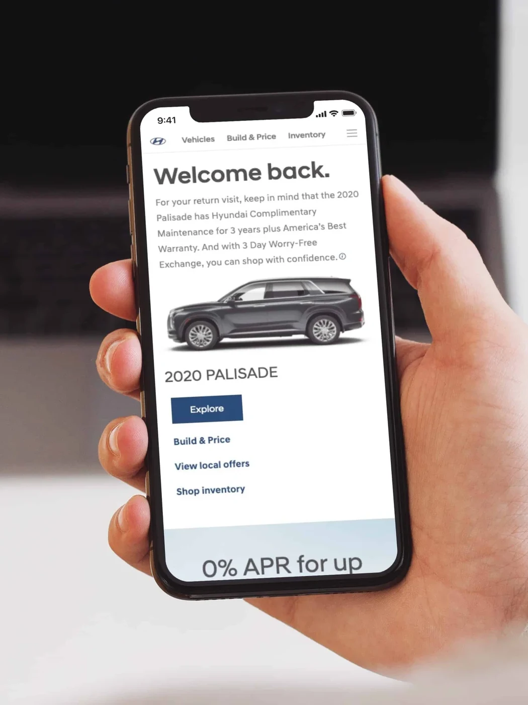
Alongside the relaunch, I initiated a personalization strategy designed to make the experience more relevant to individual customers and an AI integration program focused on improving how people navigate and interact with the platform over time.

hyundaiusa.com (opens in a new tab)

#3

Of 18 US automotive manufacturer sites in J.D. Power's Manufacturer Website Evaluation Study at launch.

+73%

Test drive leads in the first week after launch.
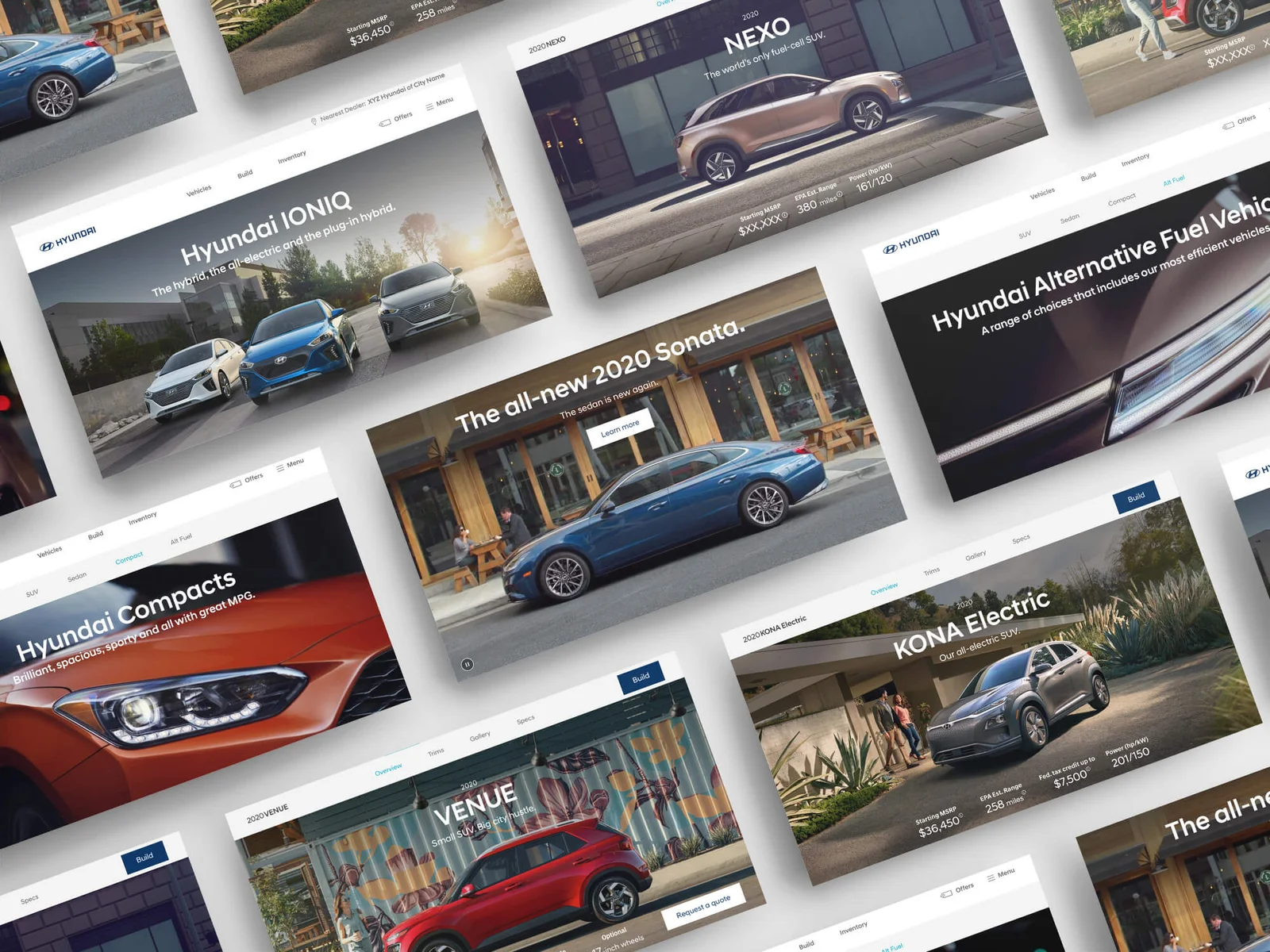
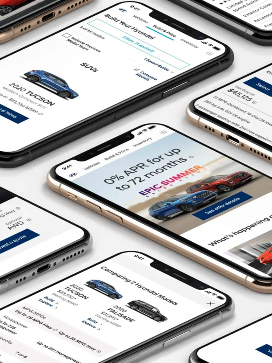
HyundaiUSA.com redesign: a spread of the new page designs
The redesigned pages shown across mobile screens
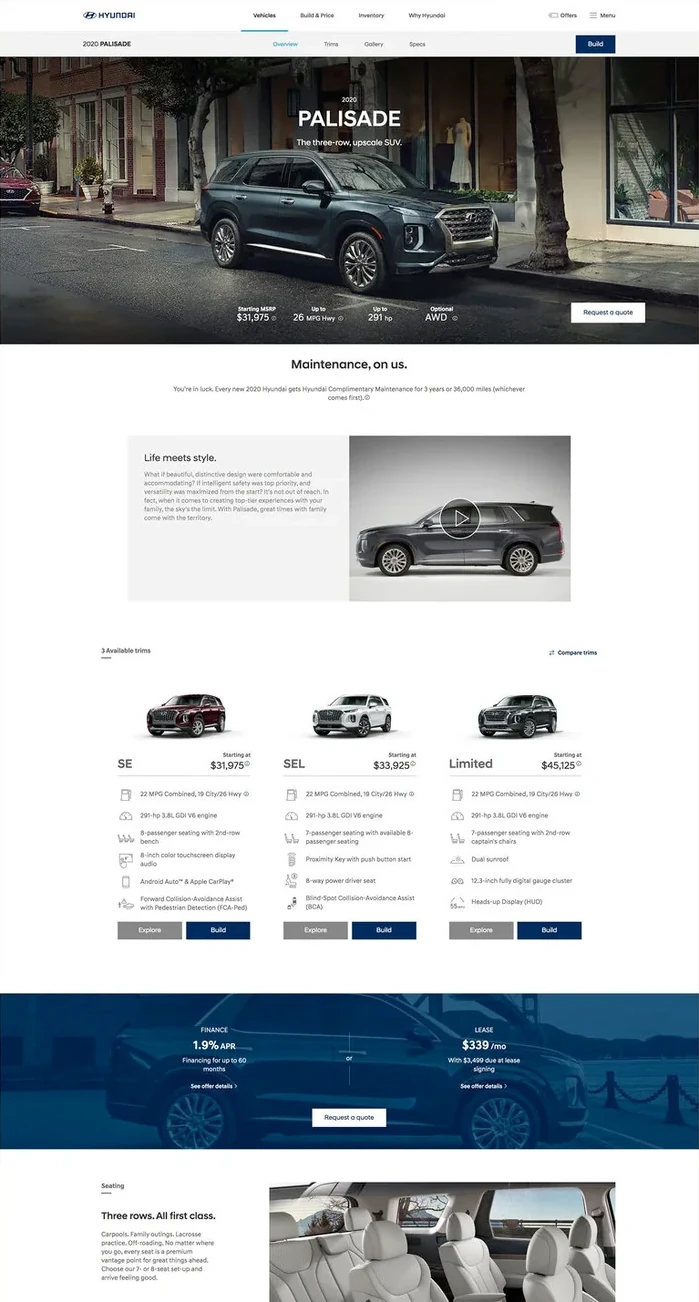
A redesigned vehicle page in full length
A personalized homepage greeting a returning visitor on mobile
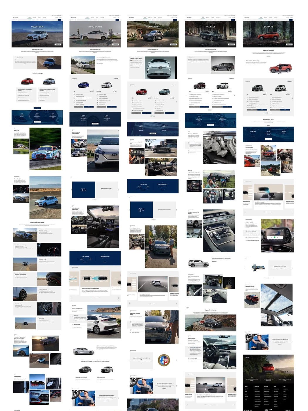
The full set of redesigned page templates

E-commerce

Where luxury experience meets digital performance.

LHW.com is the global digital platform of The Leading Hotels of the World, connecting travelers with a portfolio of independent luxury hotels.

Me and my team were responsible for the ongoing operation, development and optimization of the Sitecore-based platform. We worked in an agile delivery model, planning and releasing new features, improvements and bug fixes every two weeks across UX, web design, development, QA and analytics.

We ensured 24/7 platform operations while continuously monitoring performance, testing new ideas and improving the experience through analytics and A/B testing.

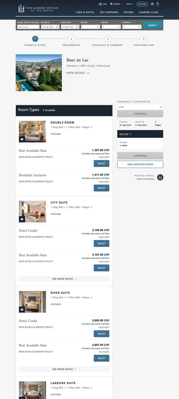
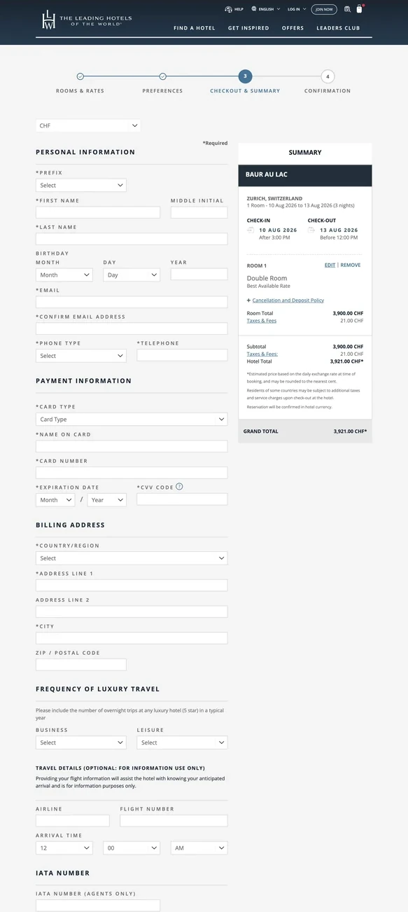
The largest transformation was a complete redesign of the booking path. We reduced the journey from seven steps to four, simplifying the experience from hotel selection through to reservation and improving conversion significantly.

The result was not a one-off redesign, but a product organization focused on continuous improvement: combining operational stability, technical delivery and conversion optimization on a global luxury travel platform.

lhw.com (opens in a new tab)

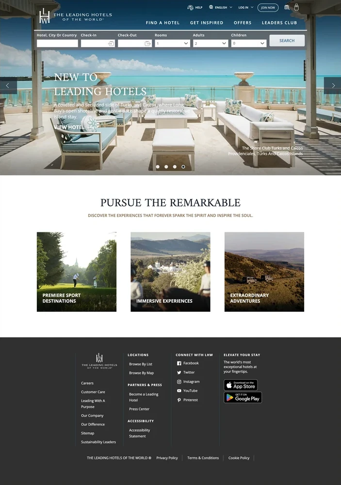
The LHW.com homepage, the entry point of the booking path
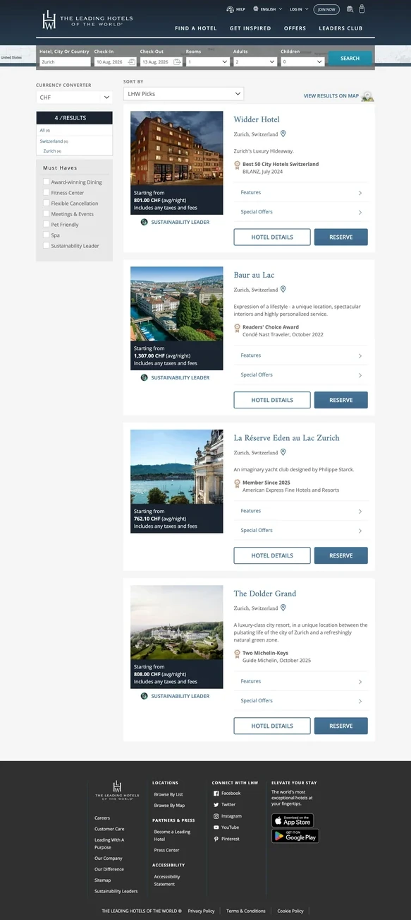
Search results listing available hotels with rates and filters
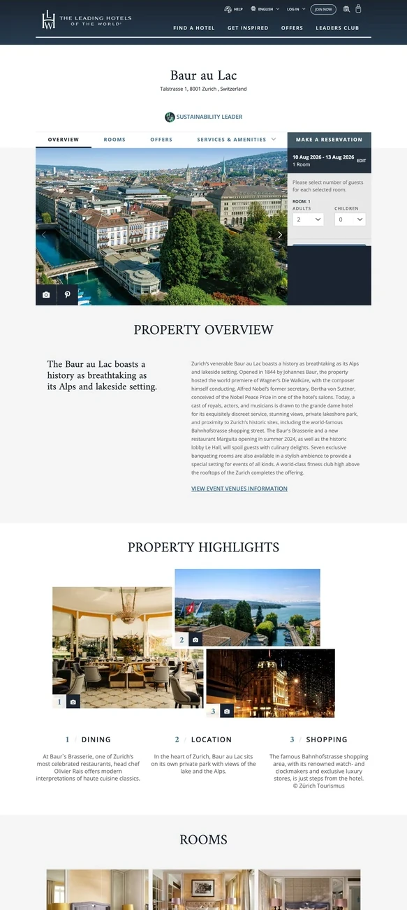
A hotel detail page with overview, highlights, rooms and local information
Room and rate selection for a chosen hotel
The checkout step with guest details and reservation summary

Application

Bringing the hotel to the guest.

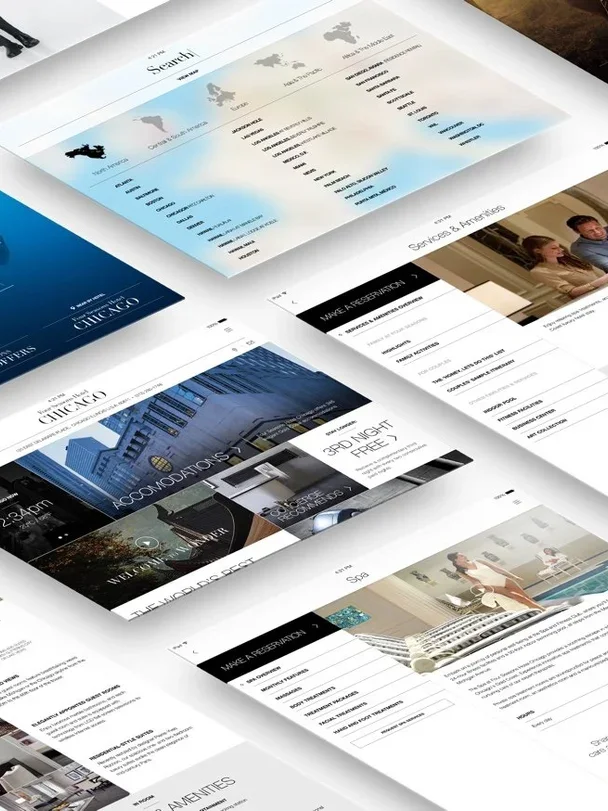
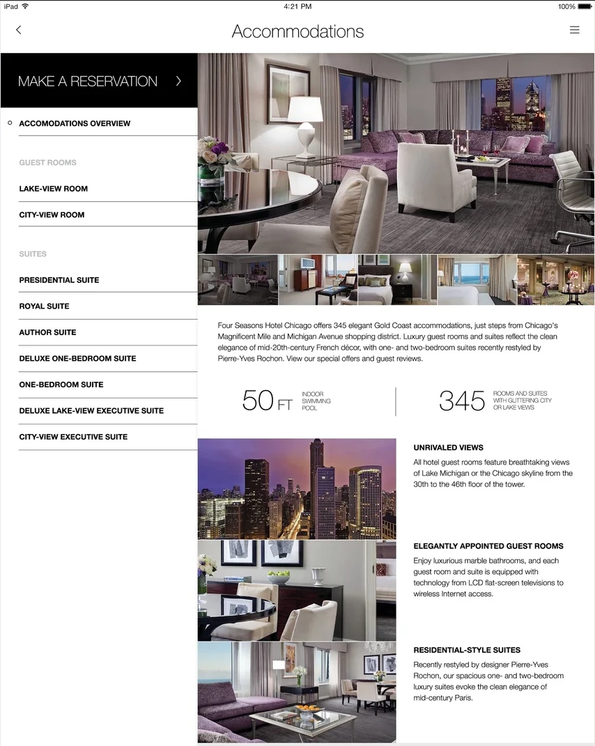
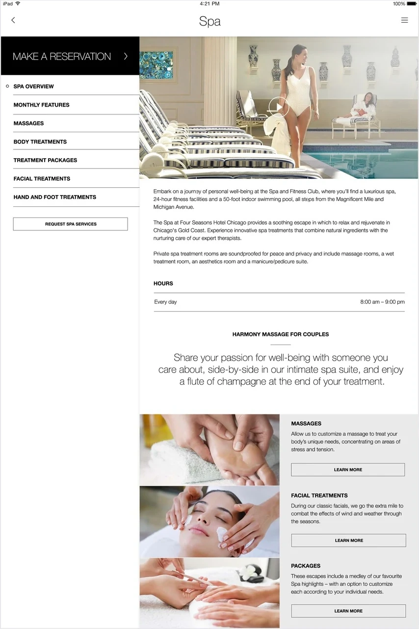
For Four Seasons, we designed an in-room digital experience that brought the hotel's services together in one place. Guests could explore activities, order amenities, shop, make requests and access services at the moment they needed them, without calling the front desk or interrupting their stay.

The interface brought together very different types of information and interaction: destination content, hotel offers, accommodation details, spa and dining, shopping and service requests. We structured the experience around the guest's stay, making it easy to move from inspiration to action without having to understand how the hotel was organized behind the scenes.

Luxury hospitality presents a particular design challenge. Technology must make the experience feel more attentive without becoming more visible. If it feels like software, it has already taken up too much space.

Strong photography, restrained interface elements and clear navigation gave the content room to breathe while keeping services close at hand. The goal was to turn a complex service environment into an experience that felt intuitive, personal and quietly present.

Four Seasons in-room concierge app
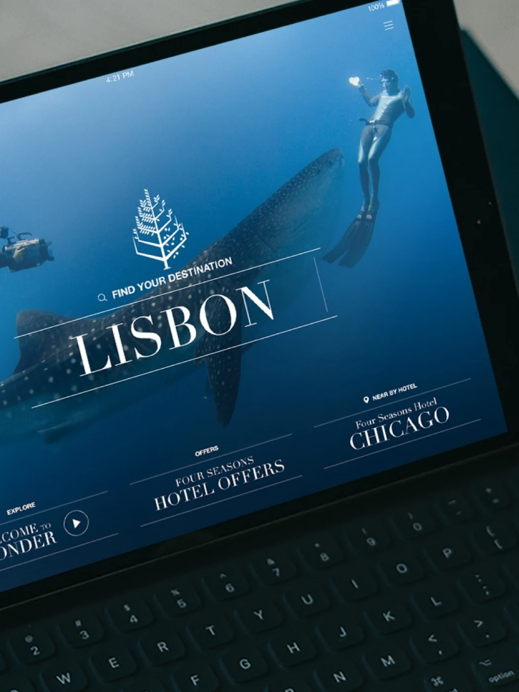
The app on a tablet, showing a hotel destination screen
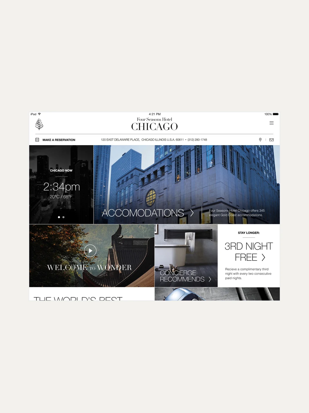
The Chicago hotel home screen with local time, weather and offers
The accommodations screen with room types, details and photography
The spa screen with treatments, hours and booking

Web platform

Turning a functional product into a visual experience.

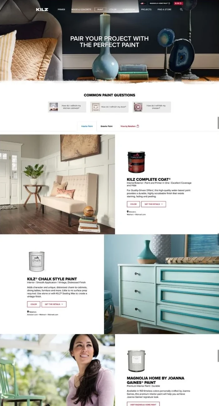
KILZ is known for primers and paint, but its digital presence needed to express more than product performance. The redesign transformed the website into a richer, more immersive brand experience.

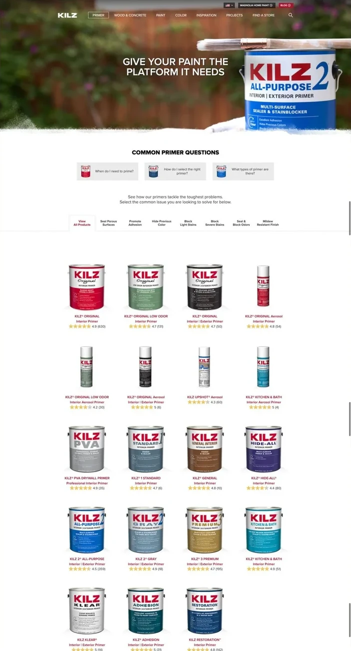
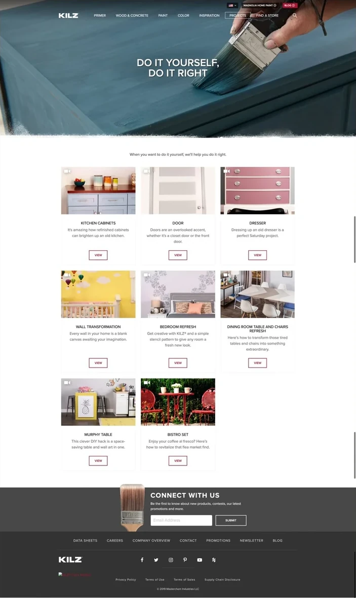
The site had to work for people arriving with very different intentions. Some were looking for ideas and color inspiration. Others needed practical answers about a surface, a specific application or the right primer and paint for the job. We organized the experience around those needs rather than expecting users to begin with product knowledge.

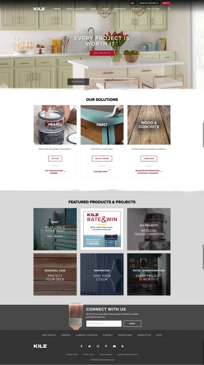
Large-scale room imagery and a more editorial visual approach gave the homepage immediate impact. Underneath it, clearer routes into product ranges, color families, project guidance and how-to content helped people move from an initial idea towards a confident decision.

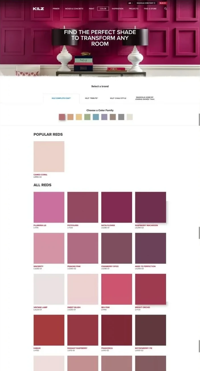
The result balanced inspiration with utility: a more premium expression of the brand that also made a technical category easier to navigate, helping people understand which products to use, where to use them and how color could transform a space.

kilz.com (opens in a new tab)

The KILZ homepage, with project inspiration and product routes
The primer range, with common questions and the full product line
The paint range, pairing products with room settings
The colour finder, showing a full family of shades
The how-to section, guiding people through a project step by step

Application

Making diagnostic information easier to understand.

Diagnostic results are usually designed for clinicians, even though the information ultimately describes the life and health of a patient.

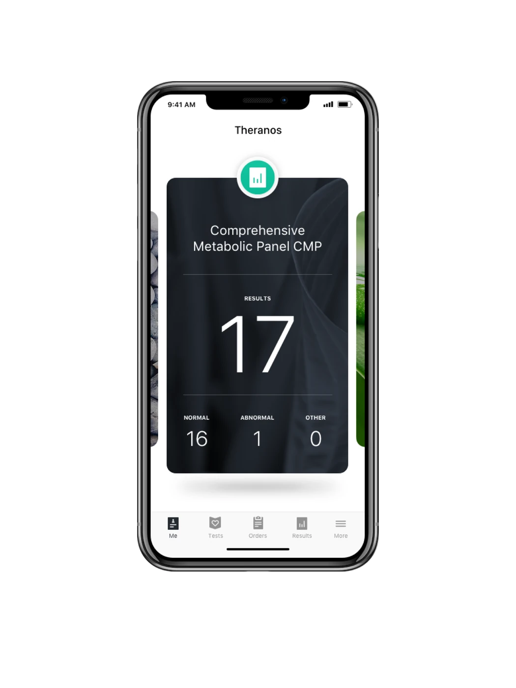
We designed a connected ecosystem of three platforms. A patient app that made results more accessible. A pharmacy based check-in experience. And a professional platform that supported physicians across the diagnostic workflow, from ordering tests and registering patients to printing specimen labels and reviewing results.

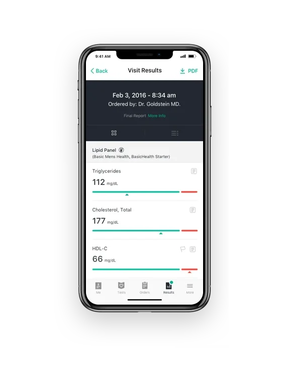
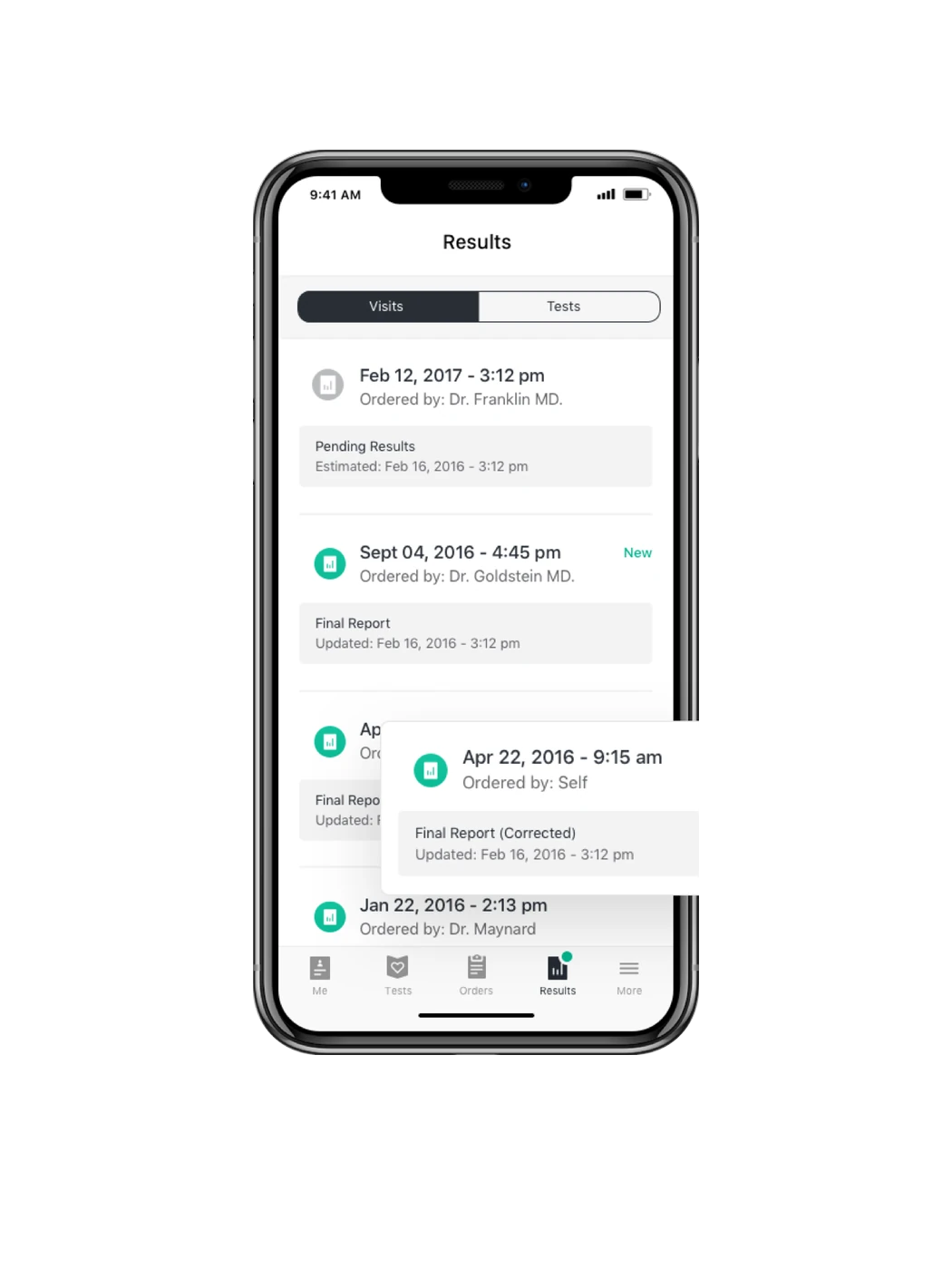
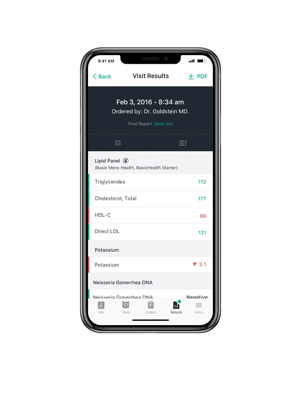
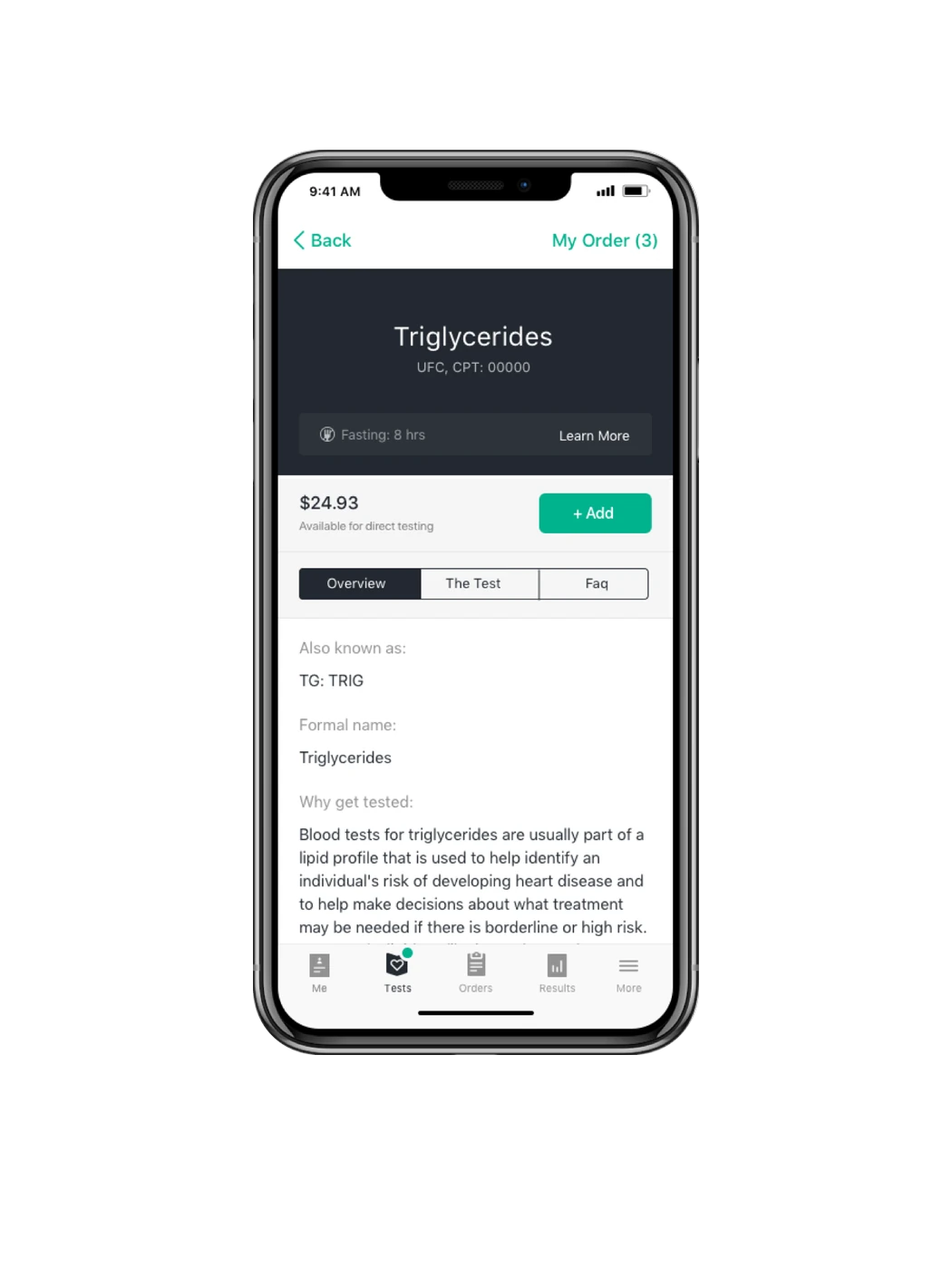
Each audience required a different level of information and control. For patients, the experience organized results by visit, explained individual tests and made values inside or outside a normal range easier to recognize. The pharmacy and professional workflows prioritized structured handovers, accuracy and the clinical detail needed to move a test from order to result.

I led the work from functional requirements and UX architecture through visual design, front-end development and quality assurance. Designing the three products as one system created consistency across touchpoints while allowing each interface to remain focused on the very different task in front of its user.

The central challenge remains relevant today. Health information is most valuable when the people it concerns can understand it, while clinicians still have the depth and precision they need.

The work was developed for Theranos before the company's claims and conduct became publicly known.

Visit results with lipid panel values
Home screen showing a completed metabolic panel with 17 results
Results list by visit, with report status per entry
A full result set with values flagged normal or abnormal
A single test explained, with price and ordering
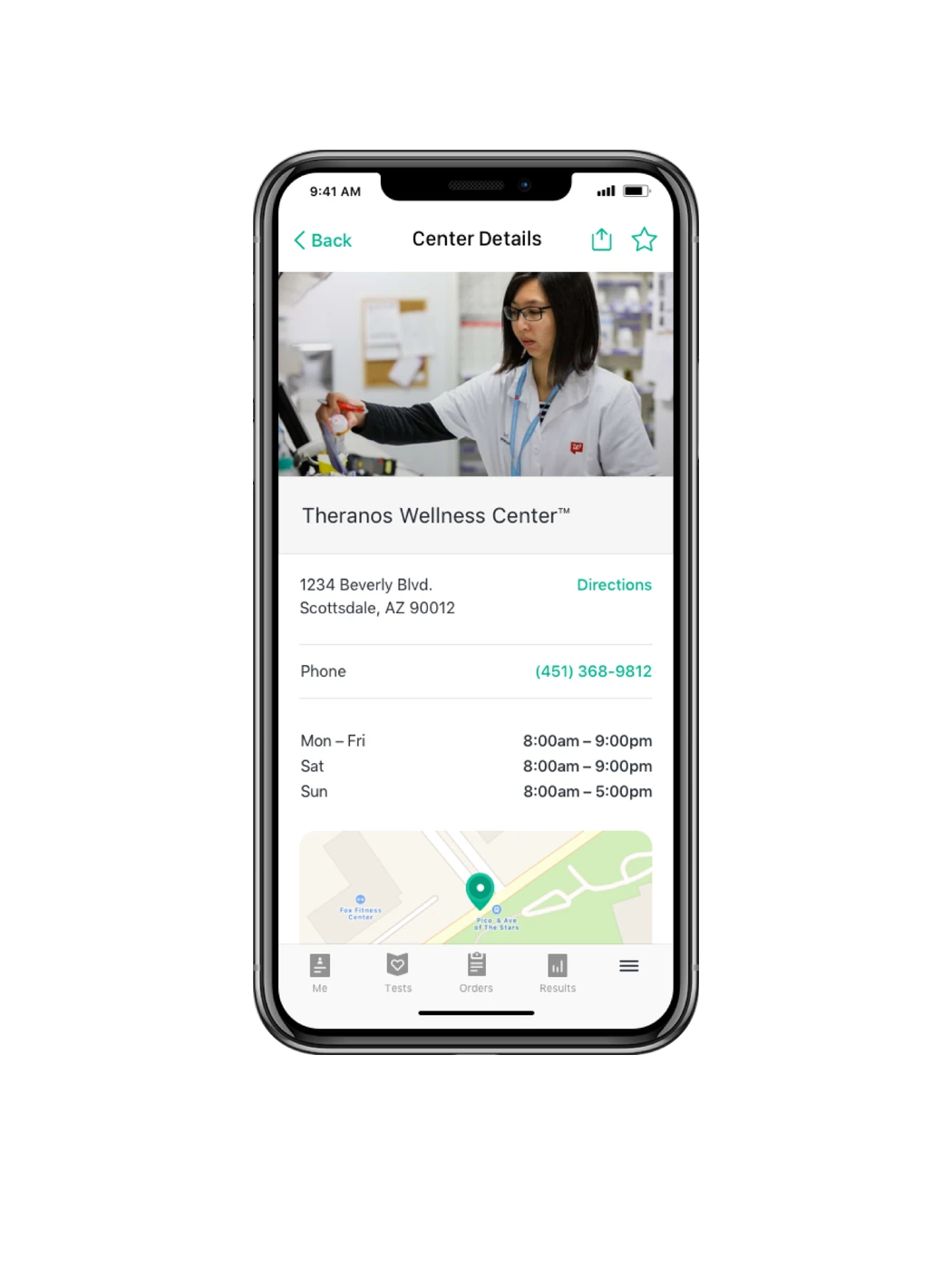
Wellness center details with address, hours and map

Web platform

Making an invisible disease visible.

Multiple sclerosis rarely follows a predictable path. Symptoms differ from person to person and can change from one day to the next, making it difficult to understand the disease through occasional clinical appointments alone.

Roche's Floodlight Open study used everyday smartphone interactions to collect data over time. The aim was to create a richer, more individual picture of how multiple sclerosis affects movement, cognition and daily life.

That longitudinal perspective was central to the idea. Rather than relying only on isolated clinical snapshots, small recurring tasks could help reveal changes and patterns that are difficult to capture during an occasional appointment.

Our task was to translate the study into an understandable digital journey and make participation feel worthwhile. The platform had to explain how the study worked, what was being measured, how personal data would be used and why a person should contribute it. Result views then had to present the information in a way that felt useful without overstating what the data could say.

In a field shaped by complexity and understandable caution, clarity became more persuasive than promotion. The experience was designed to make participation feel informed, purposeful and accessible, while preserving the trust required for people to engage with a long-term health study.

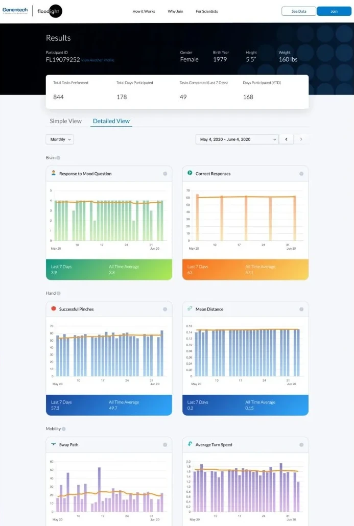
The Floodlight Open results dashboard
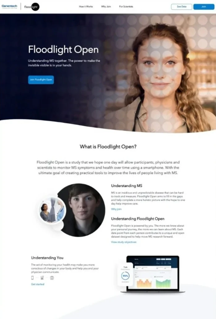
The Floodlight Open study page explaining how participation works
My Digital Experience

Eight disciplines. One connected experience.

Digital work only performs when its disciplines move together. This is the capability set I have worked across directly, both as a practitioner and as the digital leader setting the direction, aligning multidisciplinary teams and owning the outcome.

01

User Experience & Design

  • UX design
  • UX research: usability testing, prototyping
  • Information architecture
  • User journeys and service design
  • Interaction and interface design
  • Design systems and component libraries
  • Accessibility (WCAG 2.2, European Accessibility Act)
FigmaMiroAdobe XDInVision UserTesting

02

Web & Product Development

  • Business and functional requirements
  • Front end and UI engineering
  • Back end: APIs, services, database integration
  • Agile delivery (Scrum, Kanban)
  • Responsive and mobile-first builds
  • E-commerce and booking engine optimization
  • Headless and composable CMS architecture
  • Platform architecture: hosting, caching, Core Web Vitals
  • Personalization and content targeting
  • QA and release management
Adobe Experience ManagerSitecoreBloomreach UmbracoDrupalWordPressAdobe Target JiraConfluence

03

Analytics & Optimization

  • Measurement frameworks and KPI design
  • Reporting and stakeholder dashboards
  • Tracking, tagging and data layer design
  • Funnel and attribution analysis
  • A/B testing and experimentation
  • Conversion rate optimization
GA4Adobe AnalyticsGoogle Tag Manager Adobe Experience Platform TagsTealium Looker StudioTableauHotjar OptimizelyAdobe Target

05

Digital Media

  • Channel strategy and budget allocation
  • Media planning
  • Programmatic and display advertising
  • Paid search
  • Paid social
Google AdsMeta Ads Manager LinkedIn Campaign Manager

06

CRM & Lifecycle Marketing

  • CRM strategy
  • Segmentation and audience targeting
  • Email design and development
  • Customer lifecycle and marketing automation
  • Retention and win-back programs
  • List growth, paid and organic
  • Database and platform integration
  • Deliverability and consent compliance
Salesforce Marketing CloudOracle EloquaHubSpot Acoustic (Silverpop)MailchimpLitmus

07

AI

  • AI strategy and operating model
  • Rapid prototyping and concept validation
  • AI agents, tool orchestration and agentic experiences
  • AI-powered digital experiences, applications and tools
  • Generative content production: image, video, voice
  • Generative workflow testing and model evaluation
  • Conversational interfaces and voice assistants
  • Team enablement and adoption
  • Responsible AI principles and governance
ClaudeChatGPTGeminiPerplexity LangdockCrewAIn8n MidjourneyFlux KlingSeedanceWanLumaRunway HeyGenElevenLabs

08

Data Governance & Privacy

  • Privacy by design in digital products
  • GDPR, CPRA and Swiss revFADP alignment
  • Consent management and cookie governance
  • First-party data strategy
  • Data quality, taxonomy and naming conventions
  • Vendor and platform assessment
OneTrustGoogle Consent Mode

Let's build what's next.

Always happy to talk about marketing, transformation, AI, or an interesting problem that doesn't fit any of those.

Get in touch