Selected work

Platforms, campaigns and products built to last.

A selection of projects across industries, markets and disciplines. Each began with a problem without an obvious answer and evolved through strategy, creativity and technology.

Web platform

Rebuilding a carmaker's digital front door.

HyundaiUSA.com is where most people meet the brand before they meet a dealer. I led its relaunch end to end: customer experience, UX and UI, engineering, personalization, CRM, analytics, SEO and content, all from inside Hyundai's in-house agency.

That meant directing a 60-person team across strategy, design, technology, content, analytics and project management, and holding a single coherent direction across all of it. Alongside the relaunch I initiated a personalization strategy as well as an AI integration program aimed at making the digital experience more responsive to individual customers.

hyundaiusa.com (opens in a new tab)

#3

Of 18 US automotive manufacturer sites in J.D. Power's Manufacturer Website Evaluation Study at launch.

+73%

Test drive leads in the first week after launch.
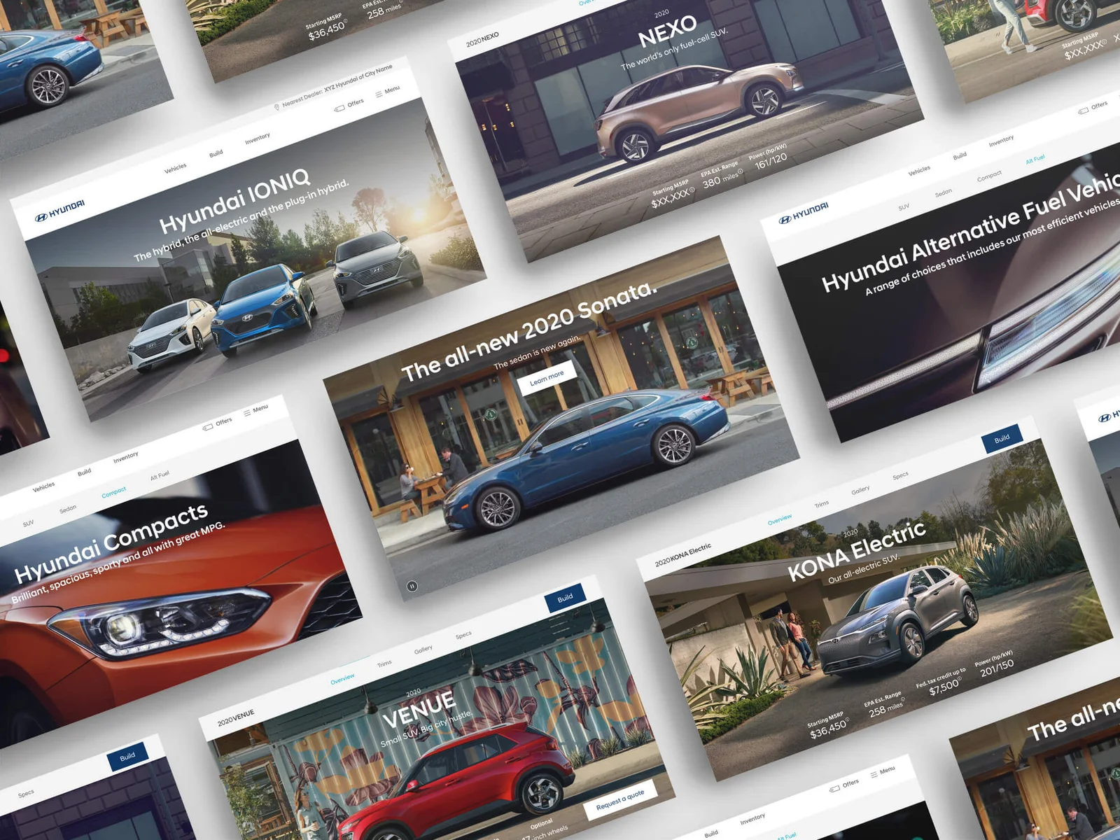
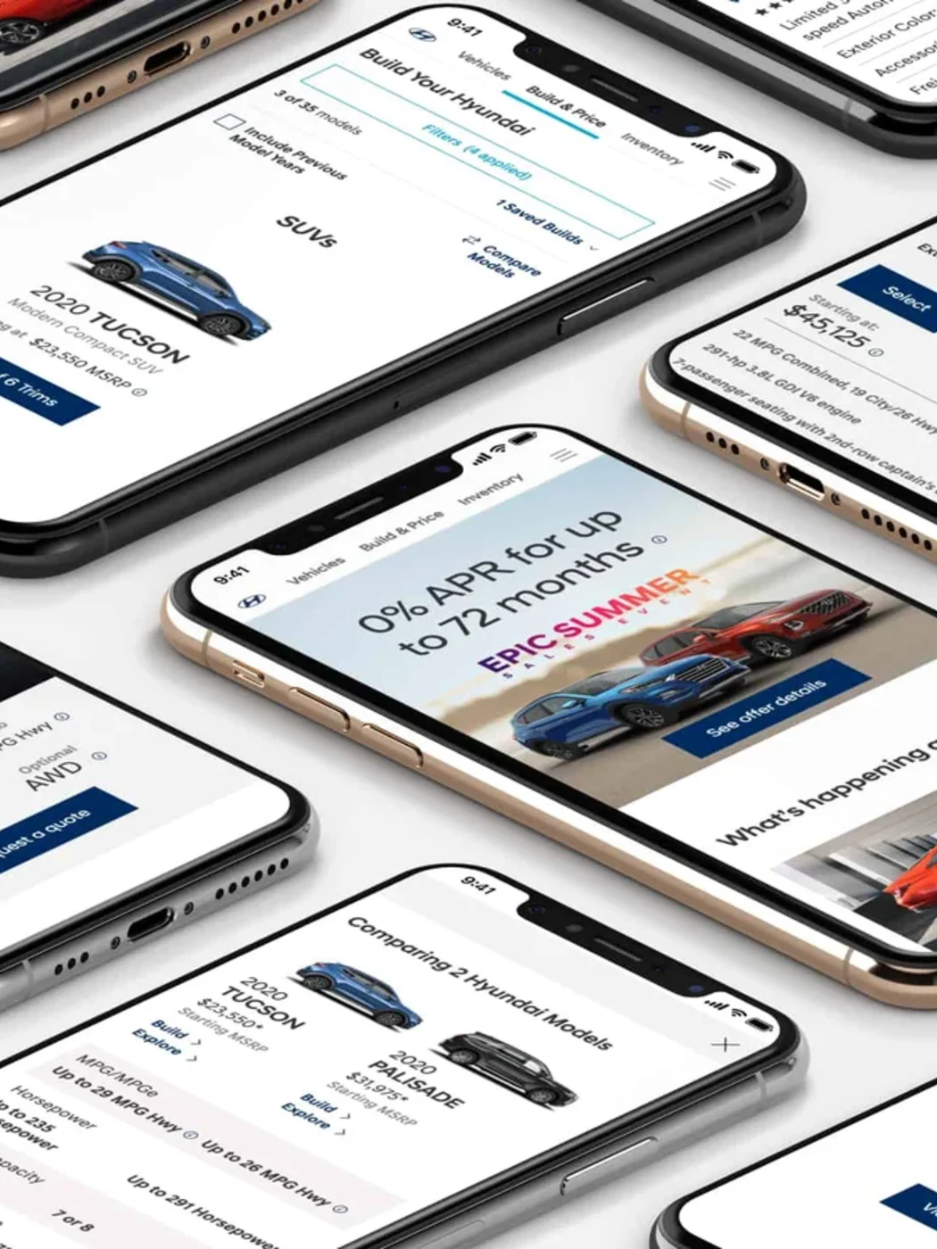
HyundaiUSA.com redesign: a spread of the new page designs
The redesigned pages shown across mobile screens
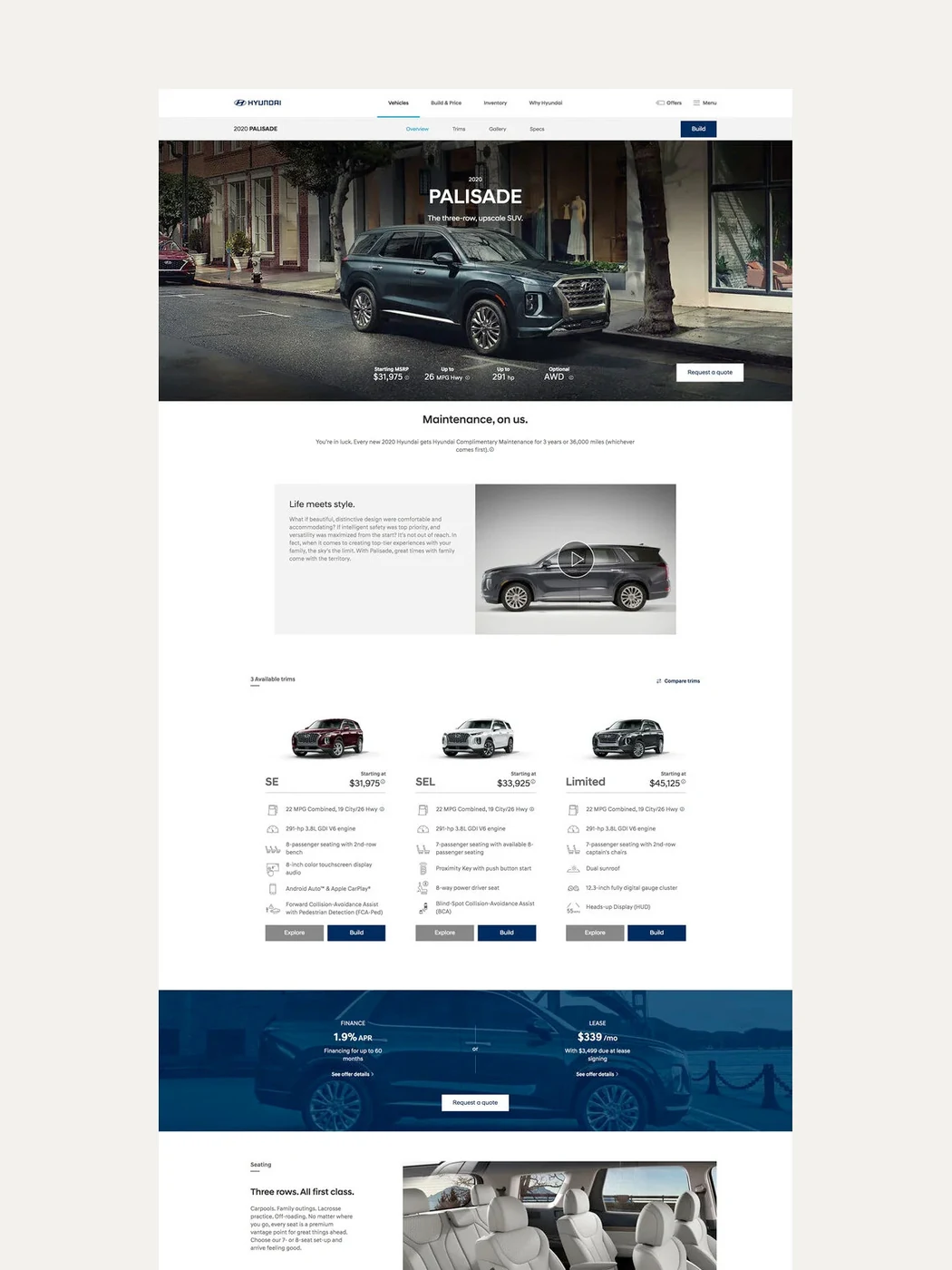
A redesigned vehicle page in full length
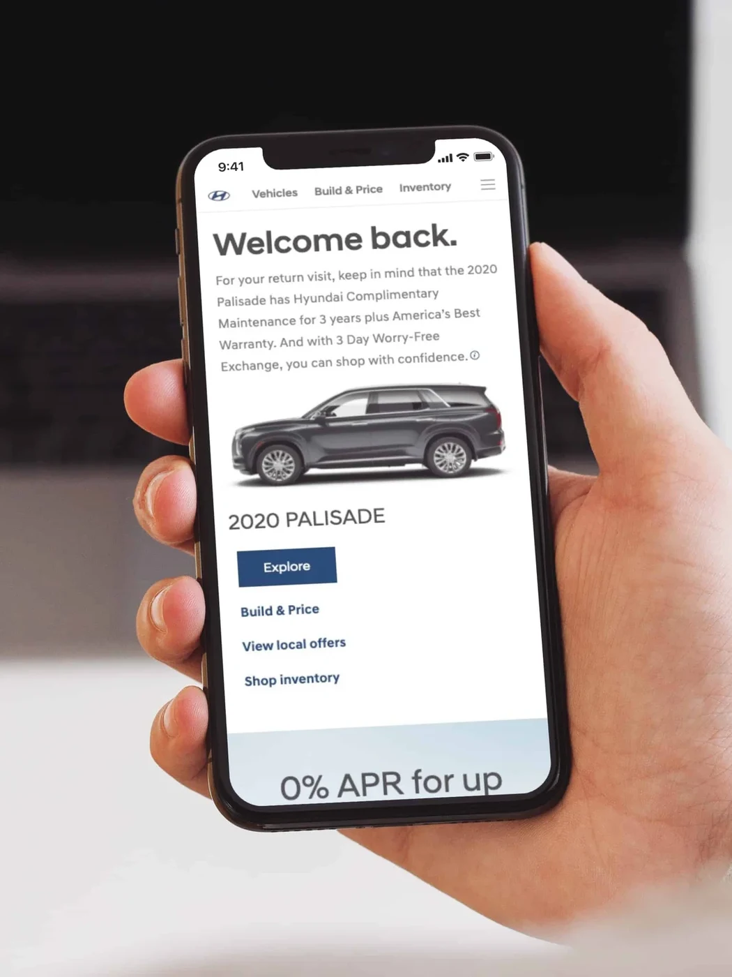
A personalized homepage greeting a returning visitor on mobile
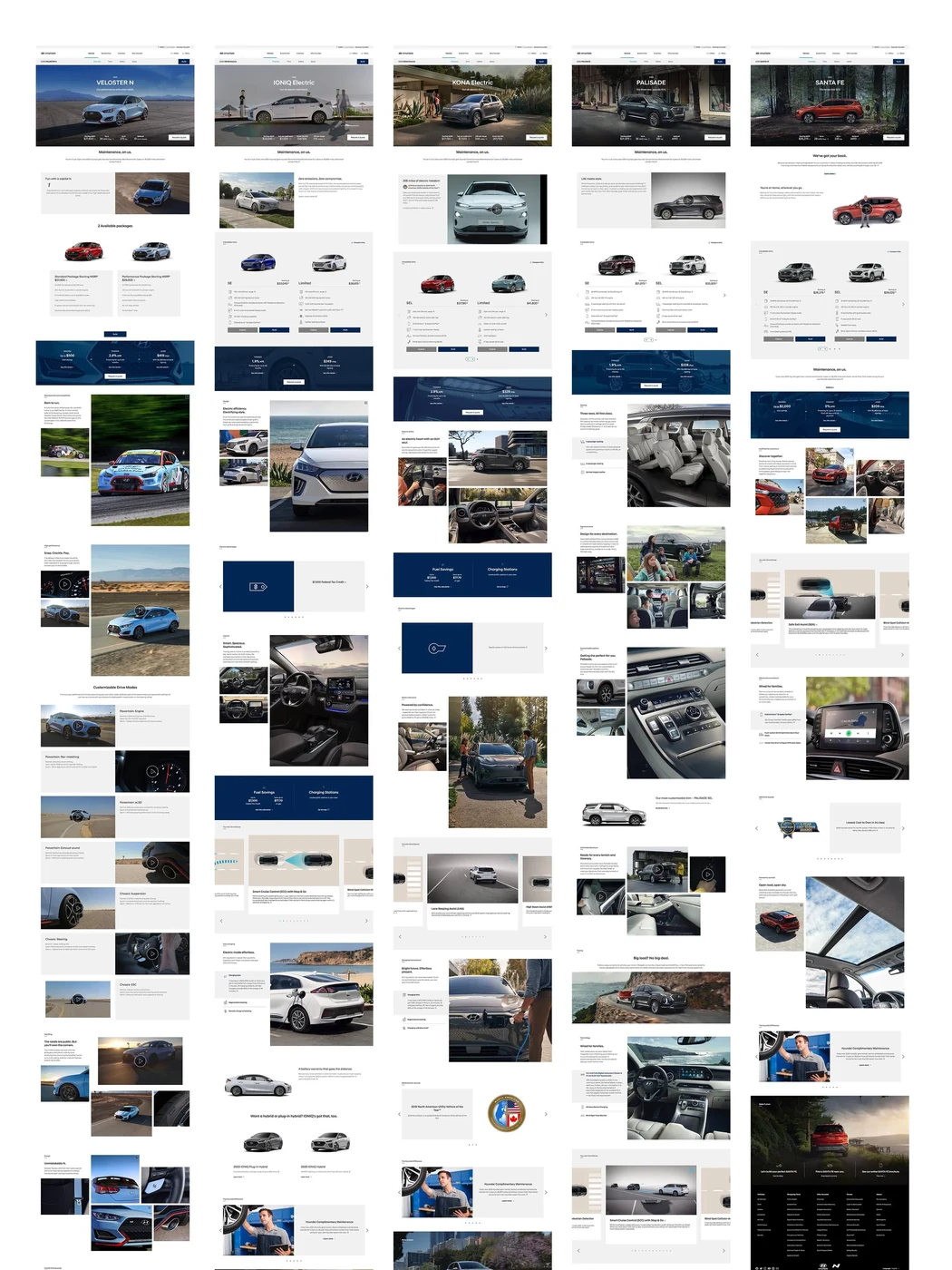
The full set of redesigned page templates

Integrated Campaign

Launching a headset for people who had never worn one.

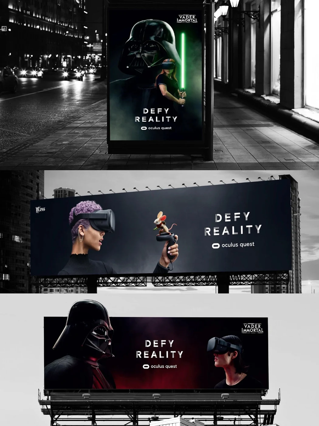
Oculus Quest was Facebook's first standalone VR headset, and it arrived with a marketing problem no budget solves. Virtual reality only makes sense once you have been inside it. First person footage does not travel. To anyone who has never worn a headset, it just looks like a video game.

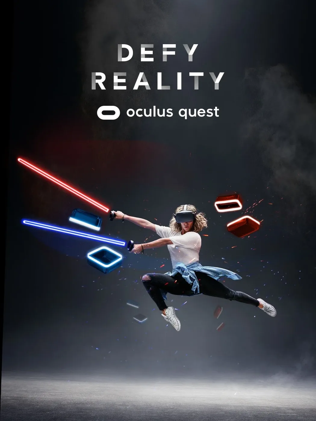
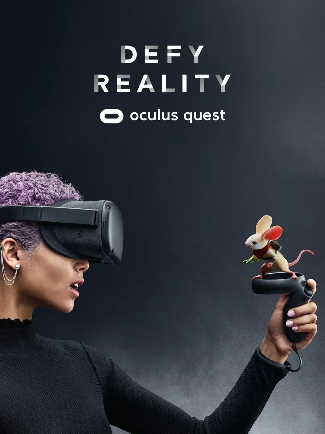
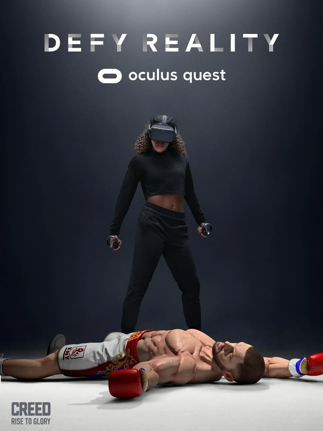
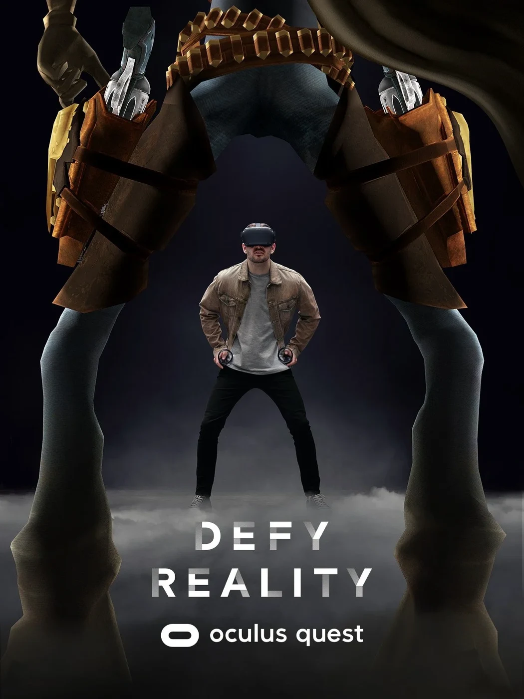
Everyone who tries VR has one moment where they briefly believe the impossible. Catching a bullet in mid air. Standing toe to toe with Darth Vader. Those moments happen to the person, not on the screen. So the campaign stopped showing the game and started showing the player, using mixed reality capture to put someone and their virtual world in the same frame. We called it "Defy Reality".

I led the project together with Meta Lab, across film, out of home in Los Angeles, San Francisco and Chicago, digital takeovers, lifestyle photography and Oculus owned channels.

Anthem Film (opens in a new tab) Cinema takeover (opens in a new tab)

Defy Reality key visual: a player swinging two light sabers
Defy Reality poster: a player beside a small virtual character
Defy Reality poster: a player standing over a defeated boxing opponent
Defy Reality poster: a player dwarfed by a virtual giant
Defy Reality out of home placements on billboards and street posters

Branding

Holding one brand together across 24 markets.

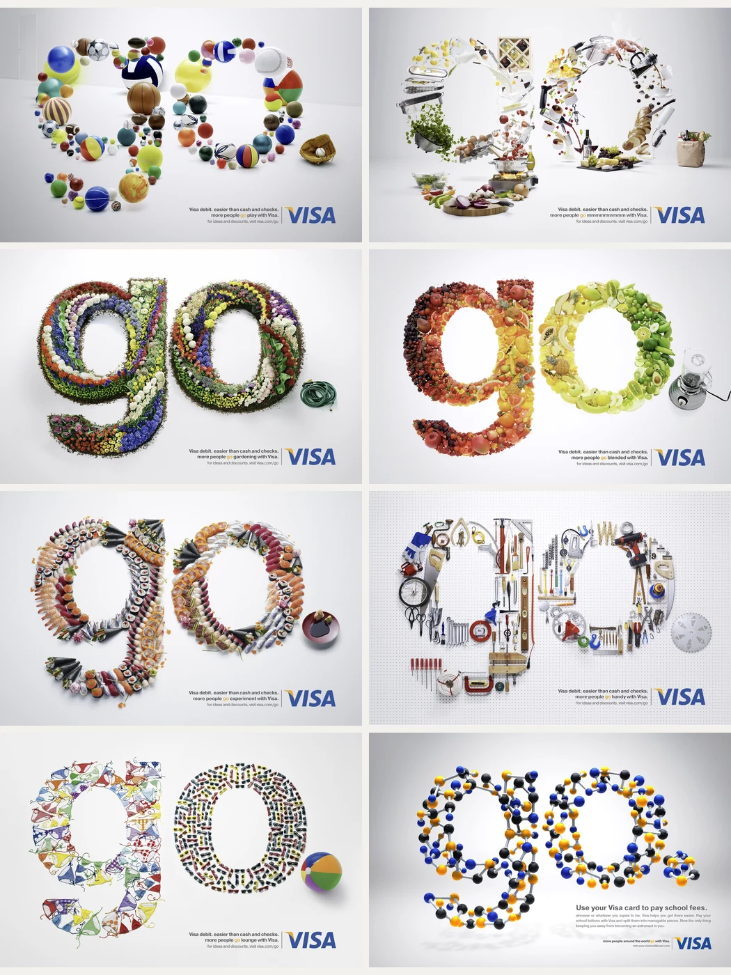
Global brand stewardship for Visa: amplifying the positioning and making sure it survived contact with 24 different markets. Every market has its own culture, its own media reality and its own good reasons to bend the brand a little. Enough small bends and there is no brand left.

So the work was less about policing and more about equipping. I mentored regional and local brand specialists and guided them on creative execution, so that consistency came from shared judgment rather than from a rulebook nobody reads.

Eight executions of the Go campaign, each spelling go from a different world of objects

AI content production

Building a car auction that never existed.

AutoScout24 Direct lets people sell their car straight to a dealer. The campaign had to make that feel simple and human, and it had to run everywhere at once: social, YouTube, automated video delivery and digital out of home, each with its own formats and cuts.

We filmed the sellers in live action and generated the world around them. The dealer scenes exist only as pixels. Midjourney built the visual worlds, Kling the sets, Veo the human motion, Seedream and Nano Banana the retouching, Topaz the scale, ElevenLabs the voices.

Generative tools did not replace the crew. They built what a crew could not have afforded to build, which is the honest case for AI in production: not cheaper versions of the same work, but work that would otherwise never have been greenlit.

TVC for AutoScout24 Direct (opens in a new tab) M&K Interview (opens in a new tab)

Integrated Campaign

Growing a community by changing the story.

The Swiss Paraplegic Foundation was already one of Switzerland's best-known non-profit organizations. But membership growth had slowed, especially among people under forty.

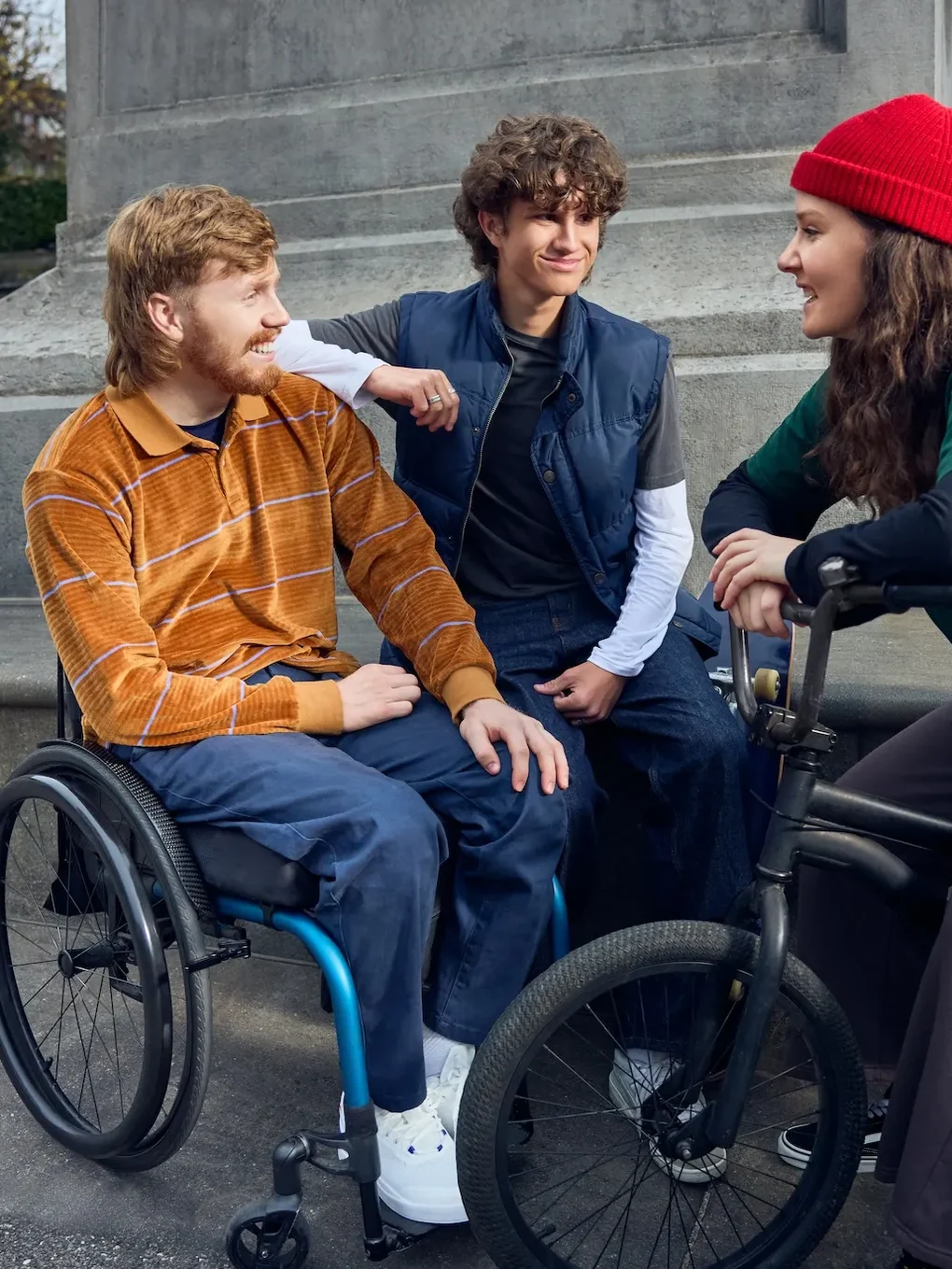
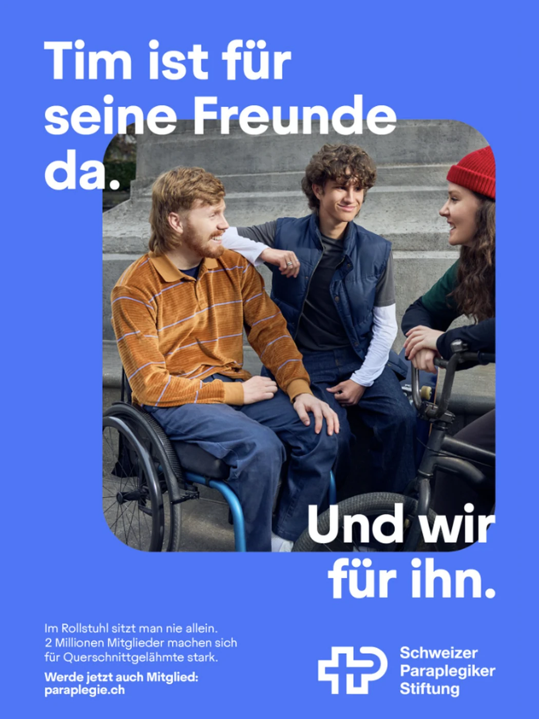
The previous communication focused on vulnerability. We shifted the story toward self-determination, showing people with spinal cord injuries not as passive recipients of support, but as active parents, partners, friends and professionals.

The campaign connected that human truth with the strength of a community of nearly two million members. It ran across television, out-of-home, digital, social and CRM, with more than 200 creative adaptations continuously optimized throughout the campaign.

The result was a powerful return to growth.
TVC for the Swiss Paraplegic Foundation (opens a video player) Making Of (opens a video player)

+75%

Net membership growth rate.
94%

Membership renewal, the highest on record.

Campaign photography: a man in a wheelchair with two friends on a set of steps
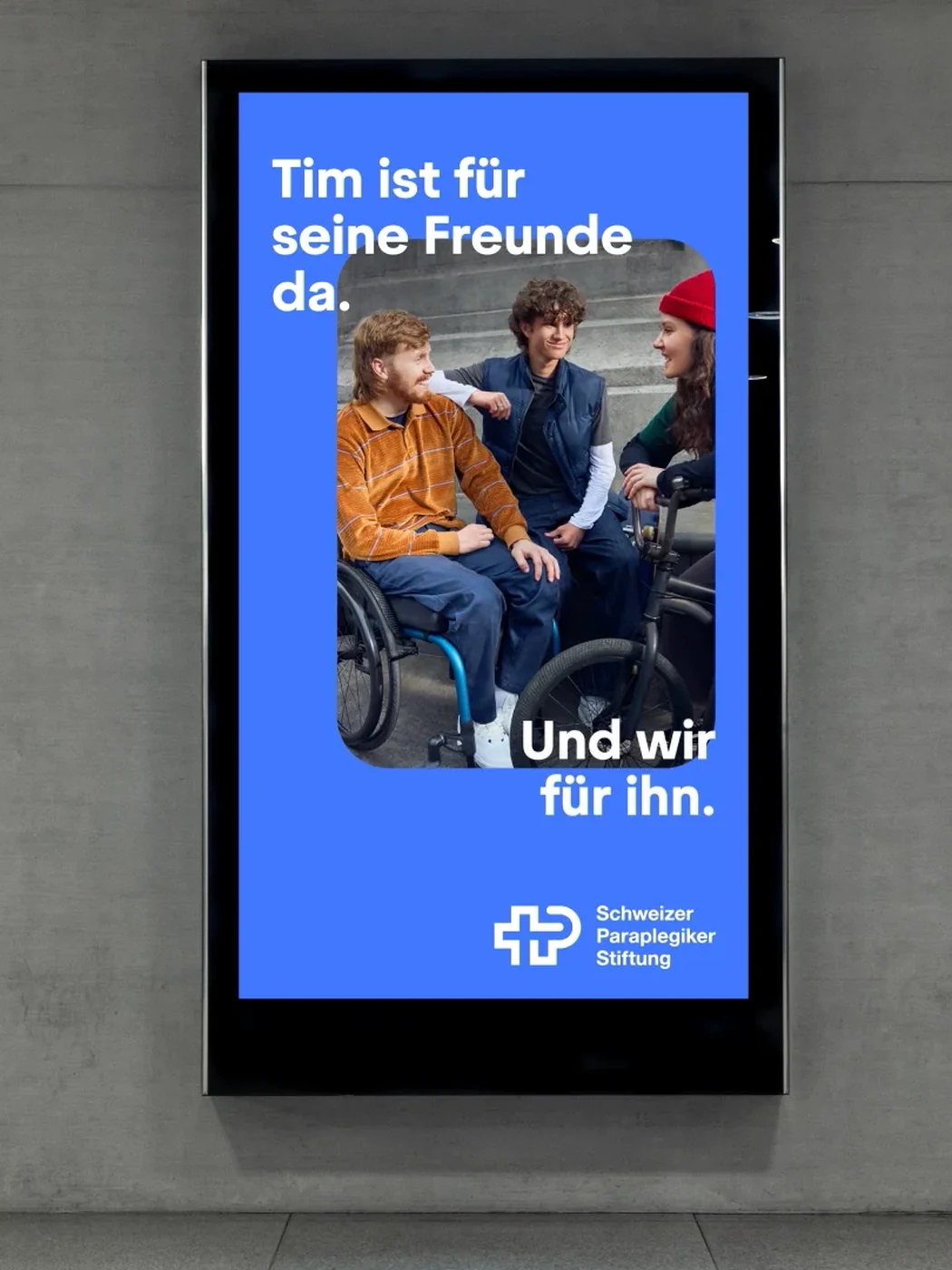
The same scene as a poster: Tim ist fuer seine Freunde da
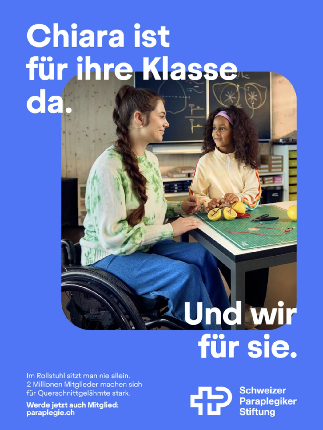
Poster: a teacher in a wheelchair with a pupil in a classroom
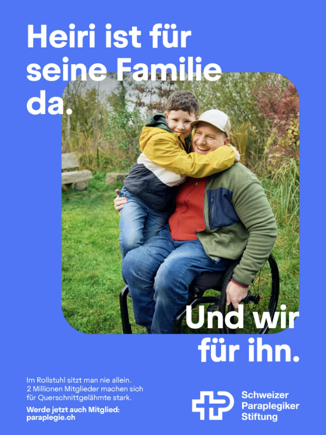
Poster: a father in a wheelchair holding his child outdoors
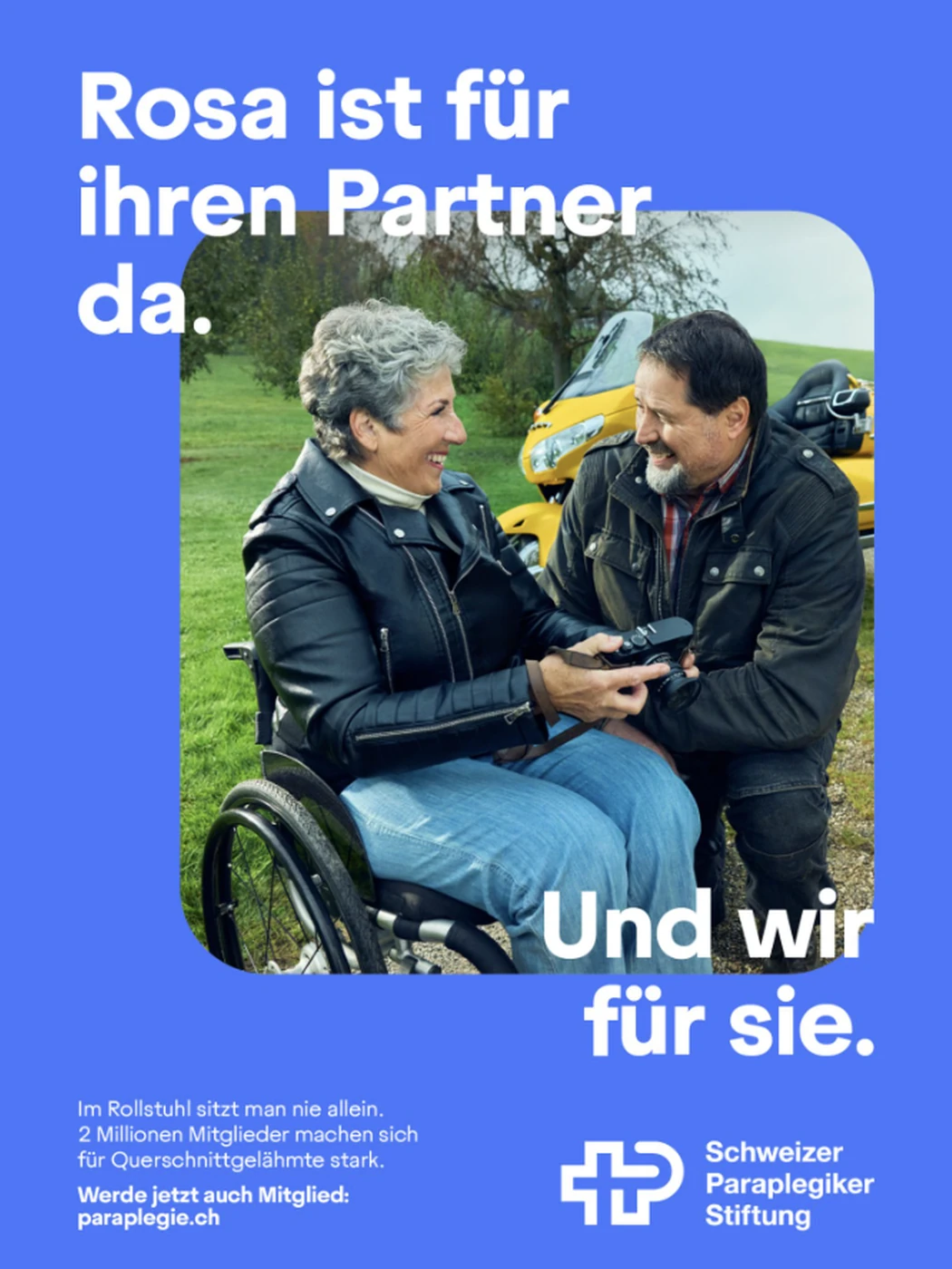
Poster: a couple outdoors, one of them in a wheelchair
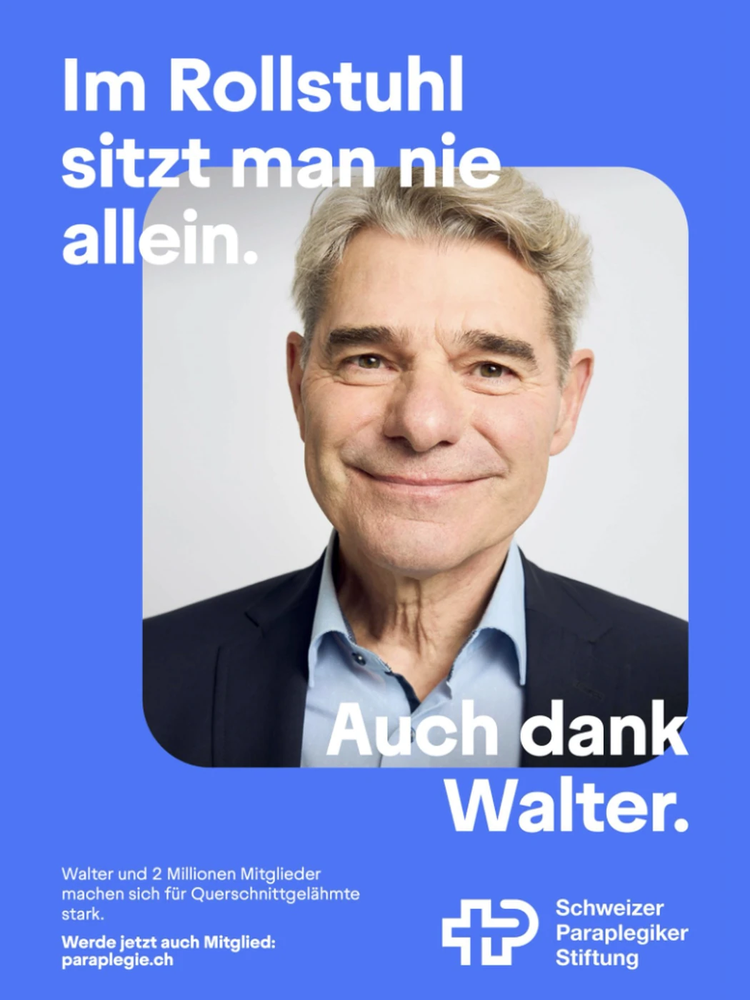
Poster from the second wave: a portrait of Walter
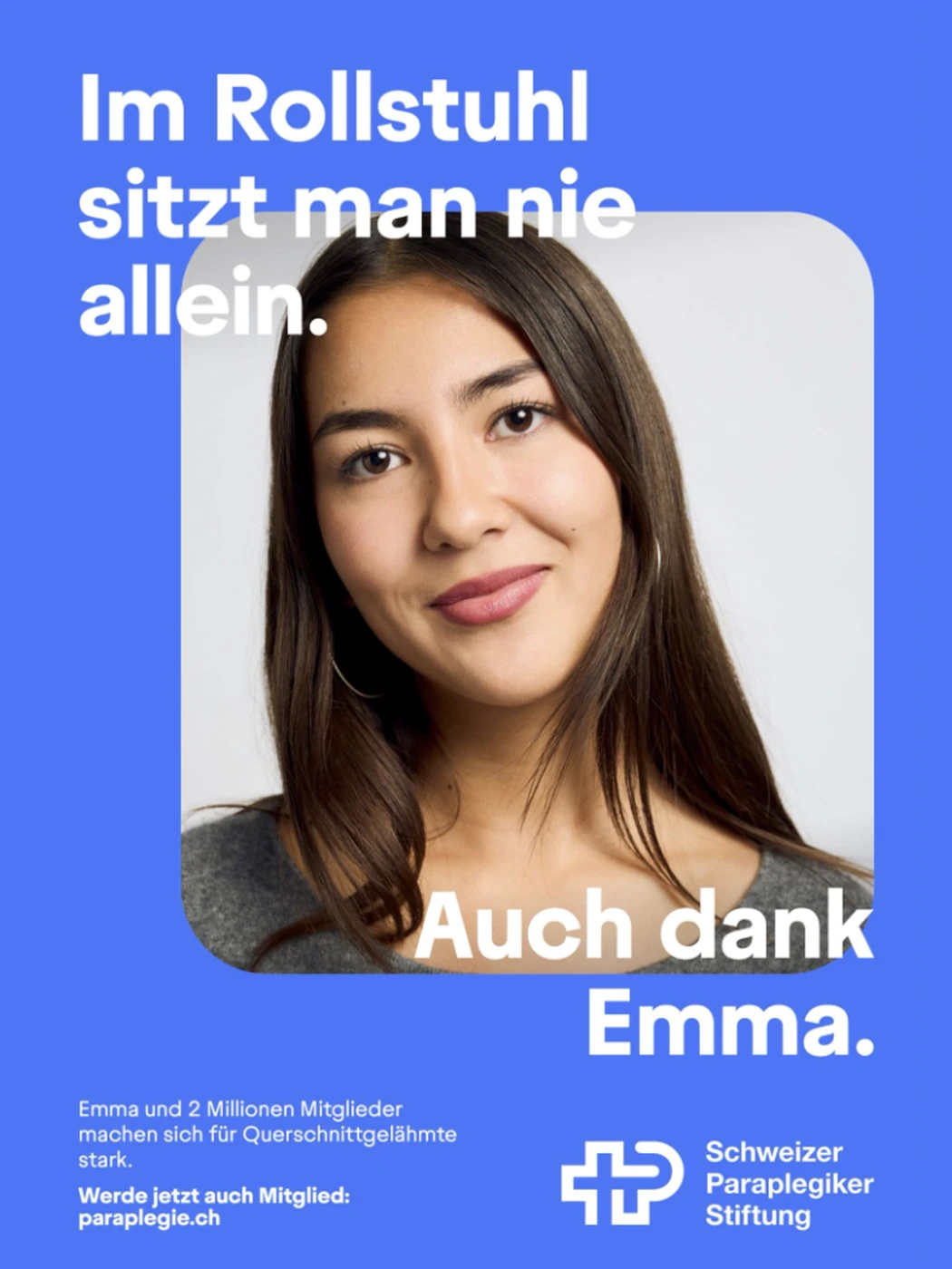
Poster from the second wave: a portrait of Emma
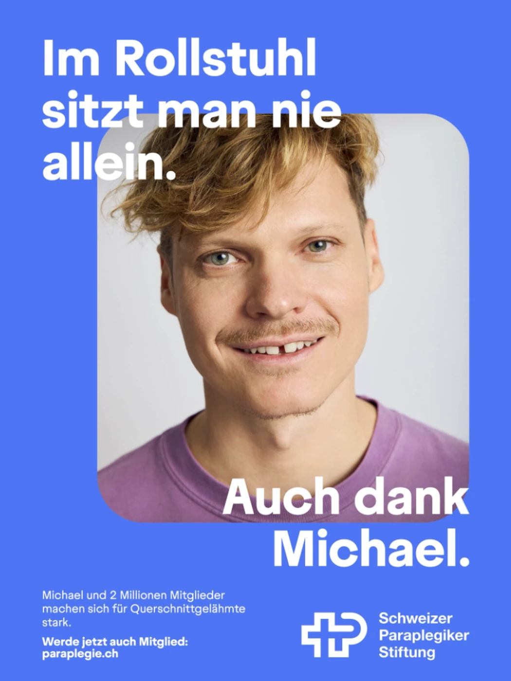
Poster from the second wave: a portrait of Michael
The campaign running as a digital out of home poster in a station

E-commerce

Where luxury experience meets digital performance.

LHW.com is the global digital platform of The Leading Hotels of the World, connecting travelers with a portfolio of independent luxury hotels.

My team was responsible for the ongoing operation, development and optimization of the Sitecore-based platform. We worked in an agile delivery model, planning and releasing new features, improvements and bug fixes every two weeks across UX, web design, development, QA and analytics.

We ensured 24/7 platform operations while continuously monitoring performance, testing new ideas and improving the experience through analytics and A/B testing.

The largest transformation was a complete redesign of the booking path. We reduced the journey from seven steps to four, simplifying the experience from hotel selection through to reservation and improving conversion significantly.

The result was not a one-off redesign, but a product organization focused on continuous improvement: combining operational stability, technical delivery and conversion optimization on a global luxury travel platform.

lhw.com (opens in a new tab)

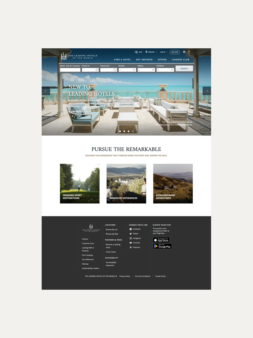
The LHW.com homepage, the entry point of the booking path
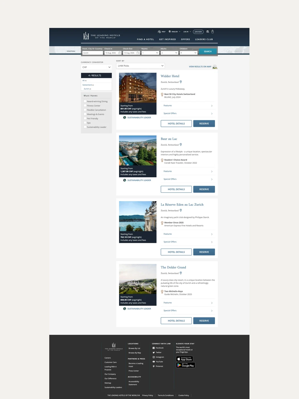
Search results listing available hotels with rates and filters
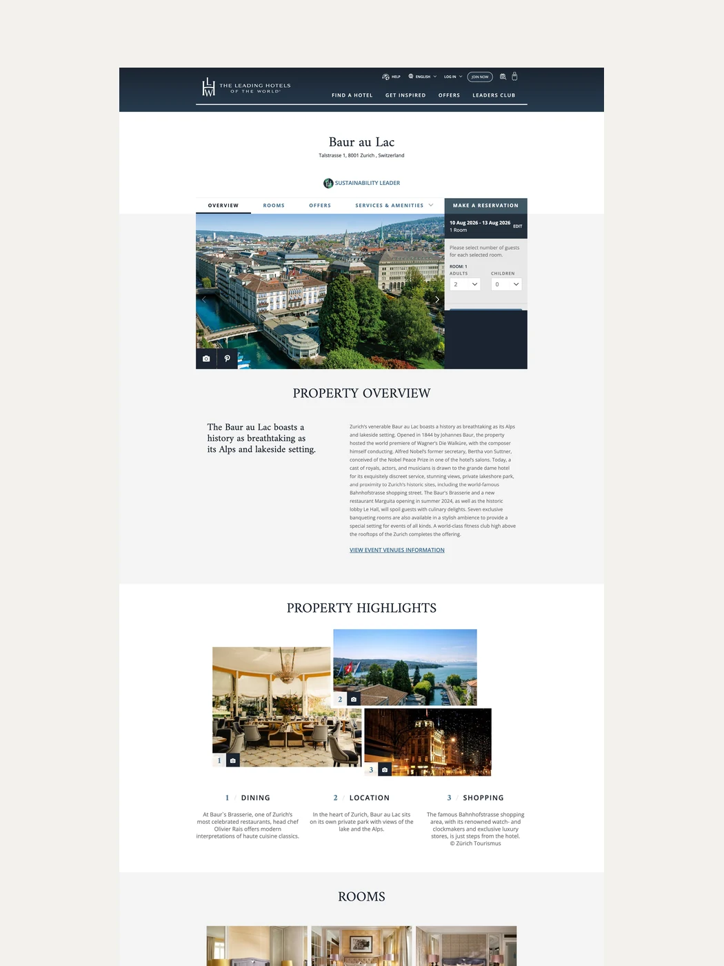
A hotel detail page with overview, highlights, rooms and local information
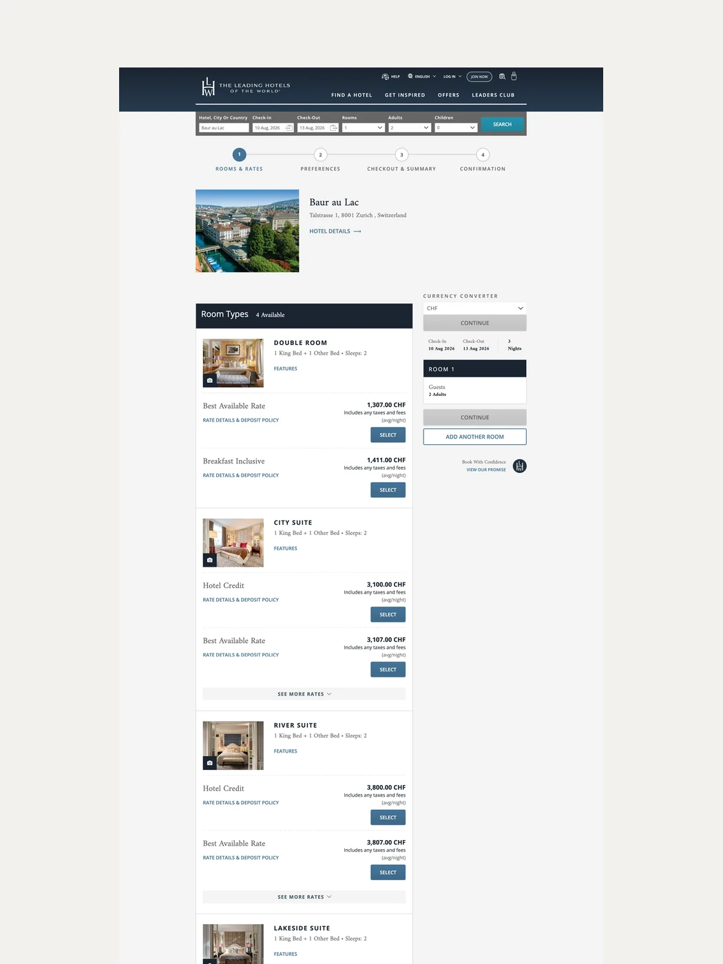
Room and rate selection for a chosen hotel
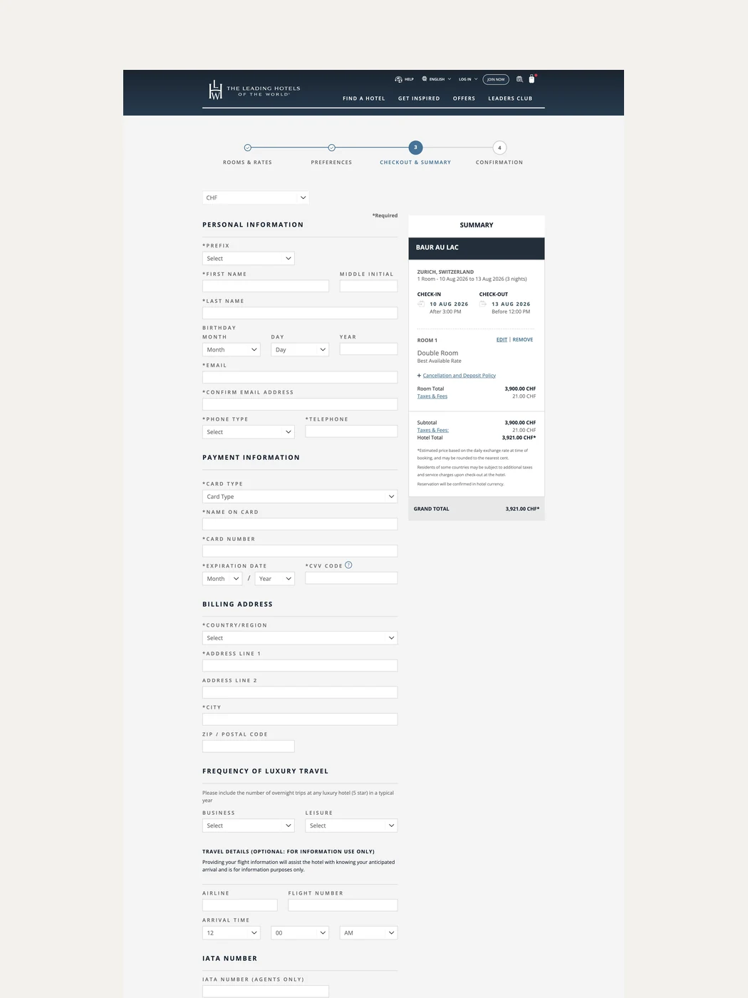
The checkout step with guest details and reservation summary

Application

Bringing the hotel to the guest.

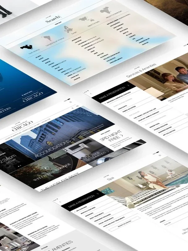
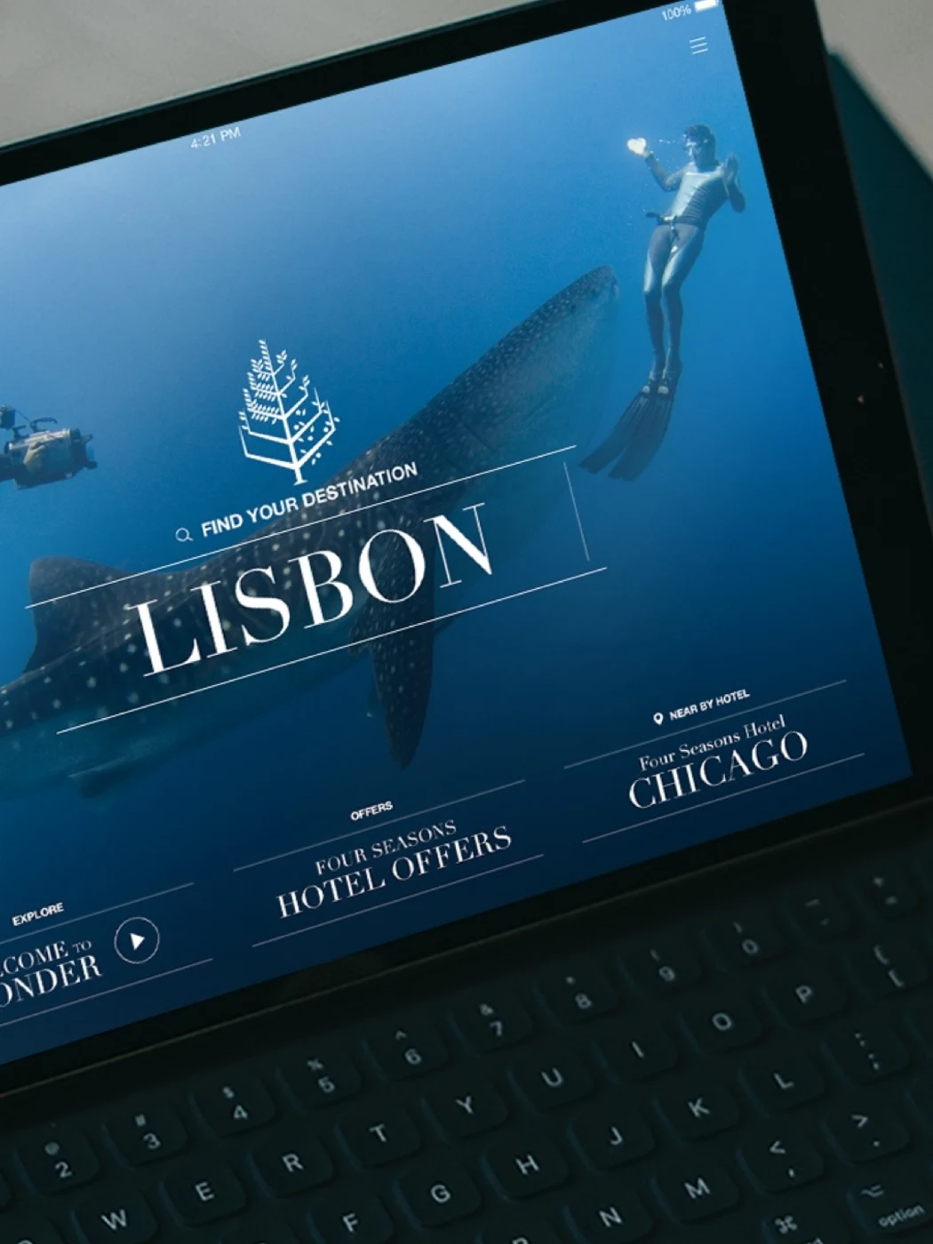
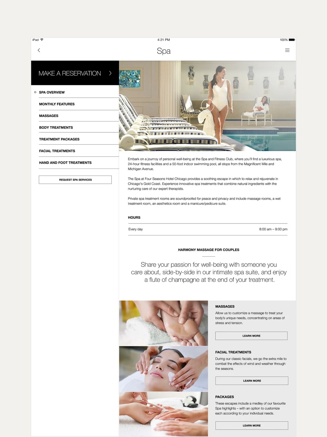
For Four Seasons, we designed an in-room digital experience that brought the hotel's services together in one place. Guests could explore activities, order amenities, shop, make requests and access services at the moment they needed them, without calling the front desk or interrupting their stay.

Luxury hospitality presents a particular design challenge. Technology must make the experience feel more attentive without becoming more visible. If it feels like software, it has already taken up too much space.

The goal was to turn a complex service environment into an experience that felt intuitive, personal and quietly present.

Four Seasons in-room concierge app
The app on a tablet, showing a hotel destination screen
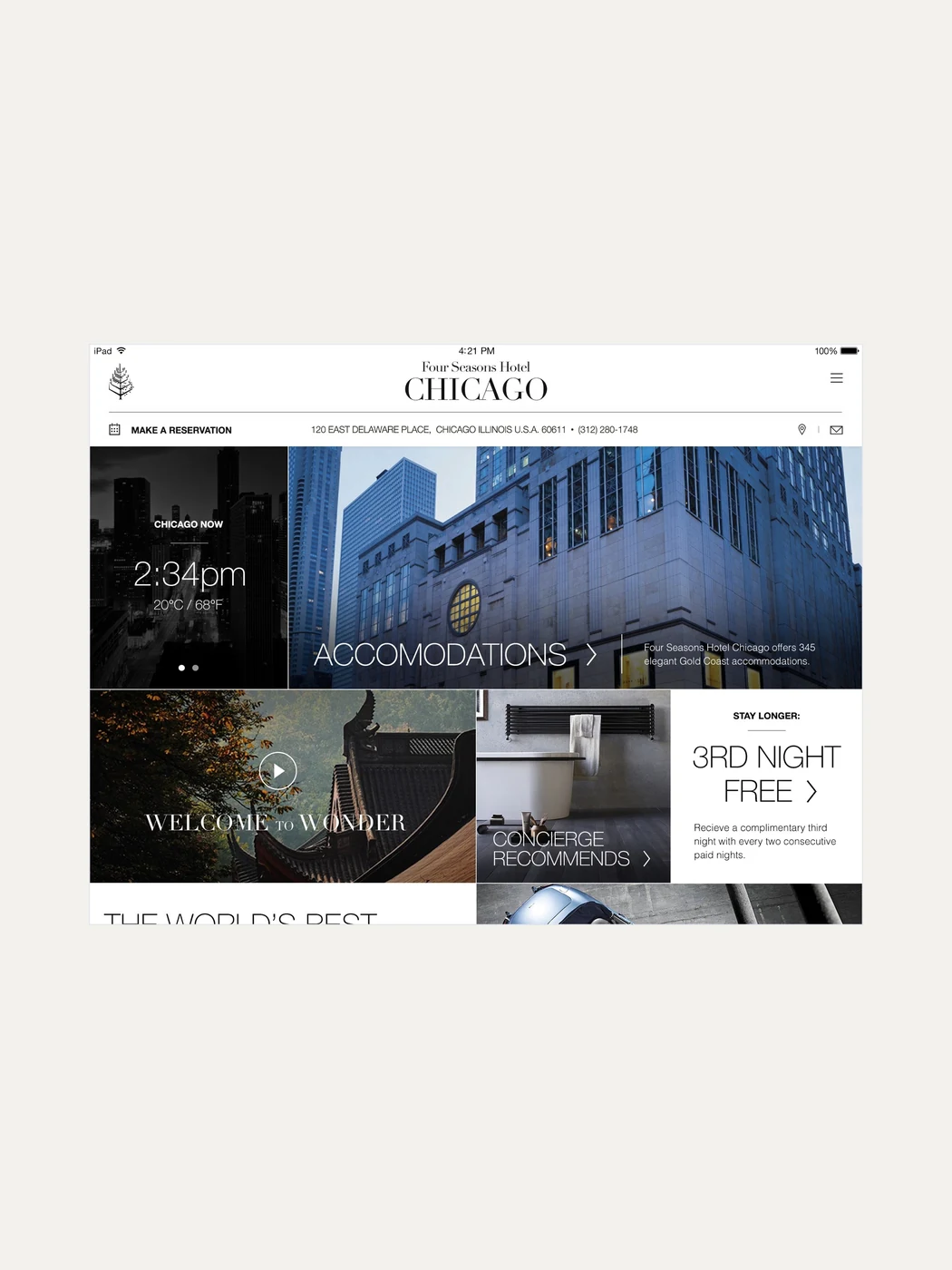
The Chicago hotel home screen with local time, weather and offers
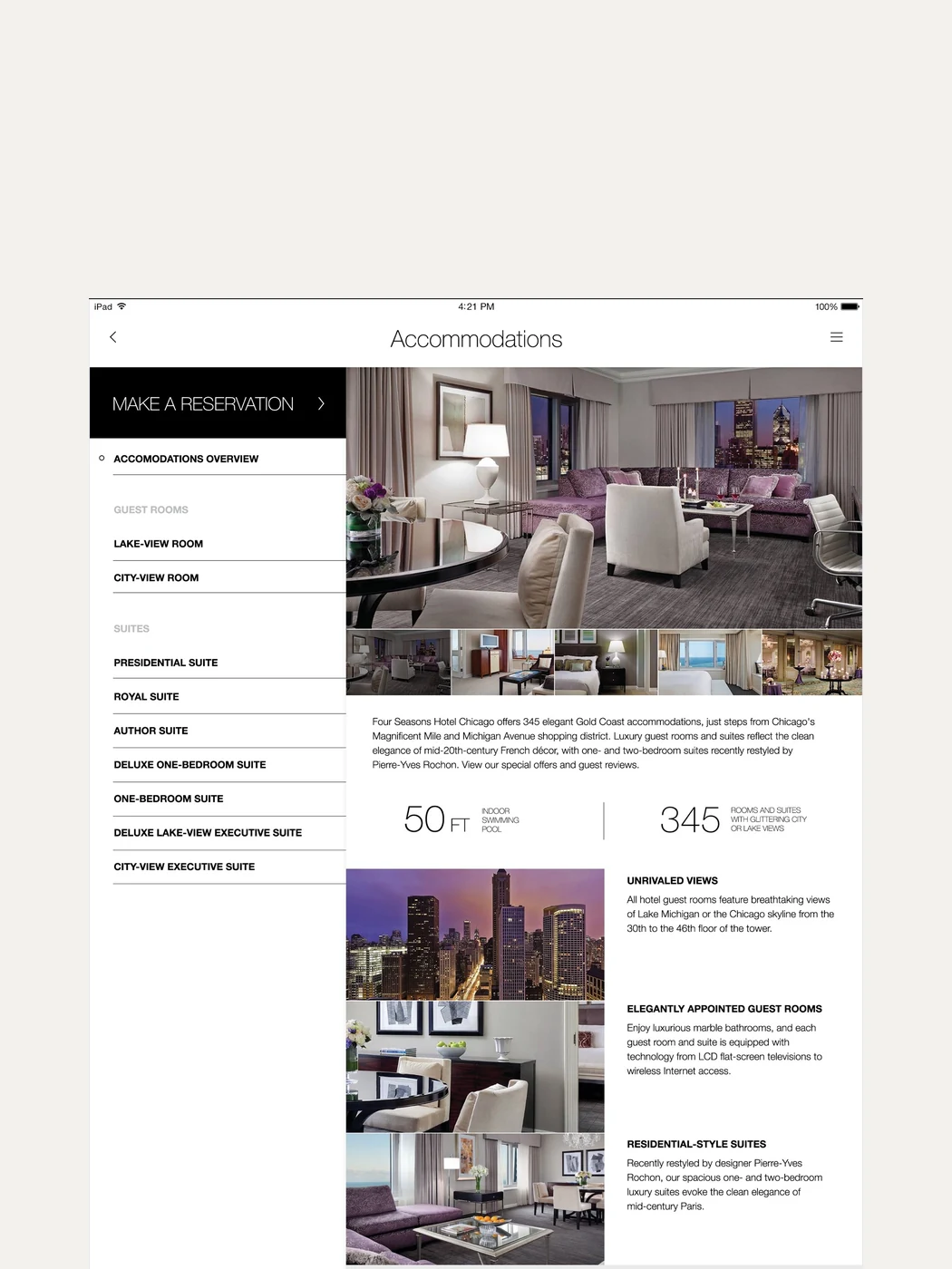
The accommodations screen with room types, details and photography
The spa screen with treatments, hours and booking

Application

Making diagnostic information easier to understand.

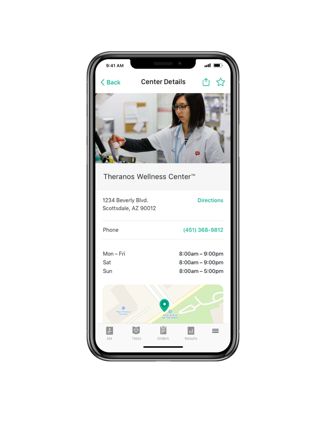
Diagnostic results are usually designed for clinicians, even though the information ultimately describes the life and health of a patient.

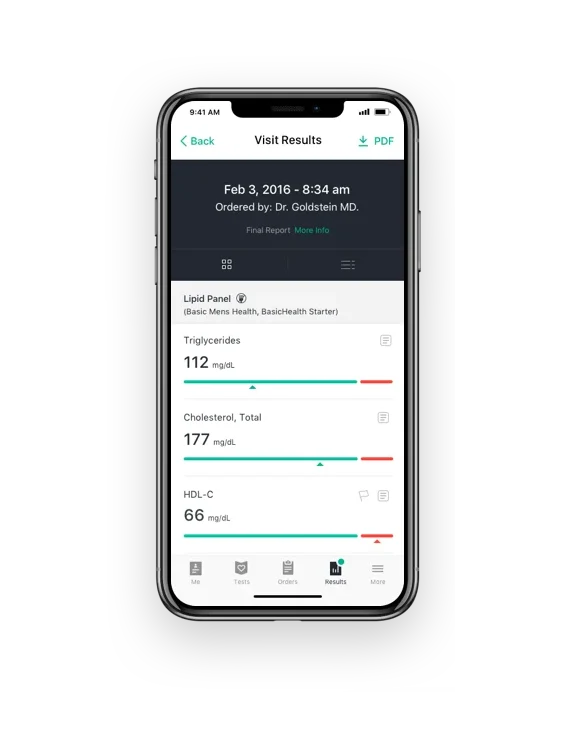
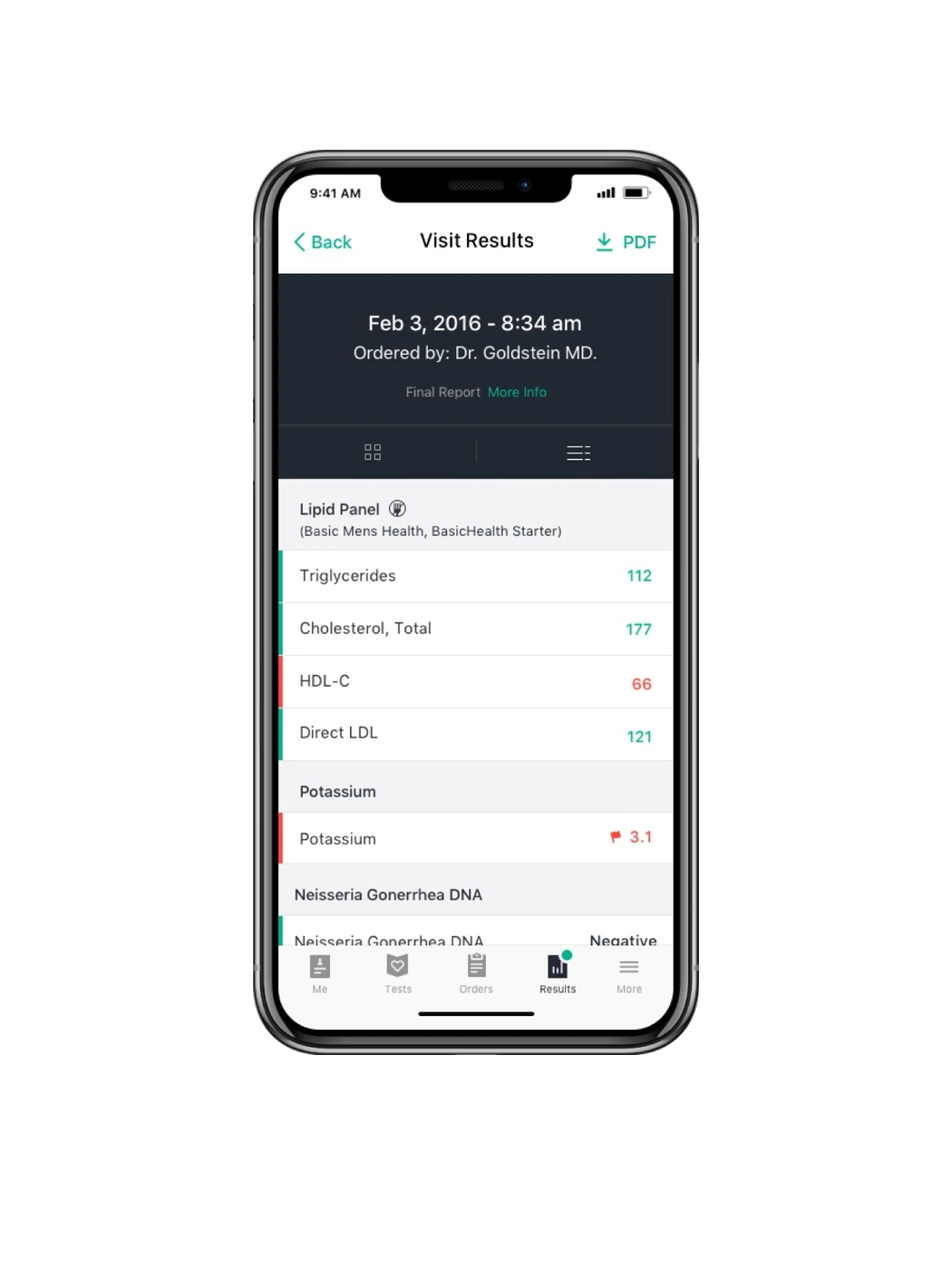
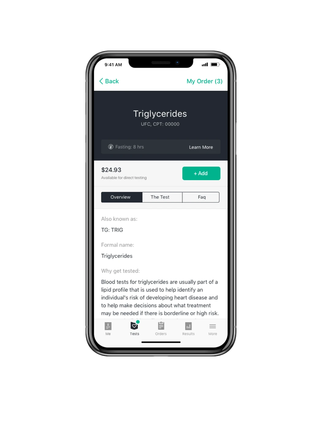
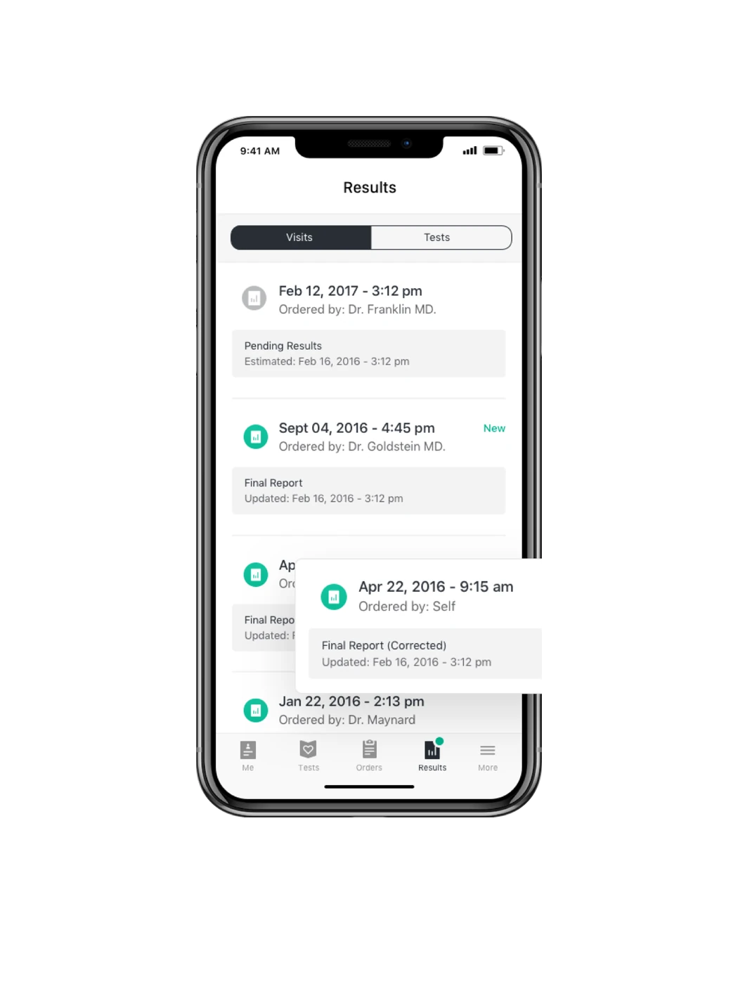
We designed a connected ecosystem of three platforms. A patient app that made results more accessible. A pharmacy based check-in experience. And a professional platform that supported physicians across the diagnostic workflow, from ordering tests and registering patients to printing specimen labels and reviewing results.

We led the work from functional requirements and UX architecture through visual design, front-end development and quality assurance.

The central challenge remains relevant today. Health information is most valuable when the people it concerns can understand it, while clinicians still have the depth and precision they need.

The work was developed for Theranos before the company's claims and conduct became publicly known.

Visit results with lipid panel values
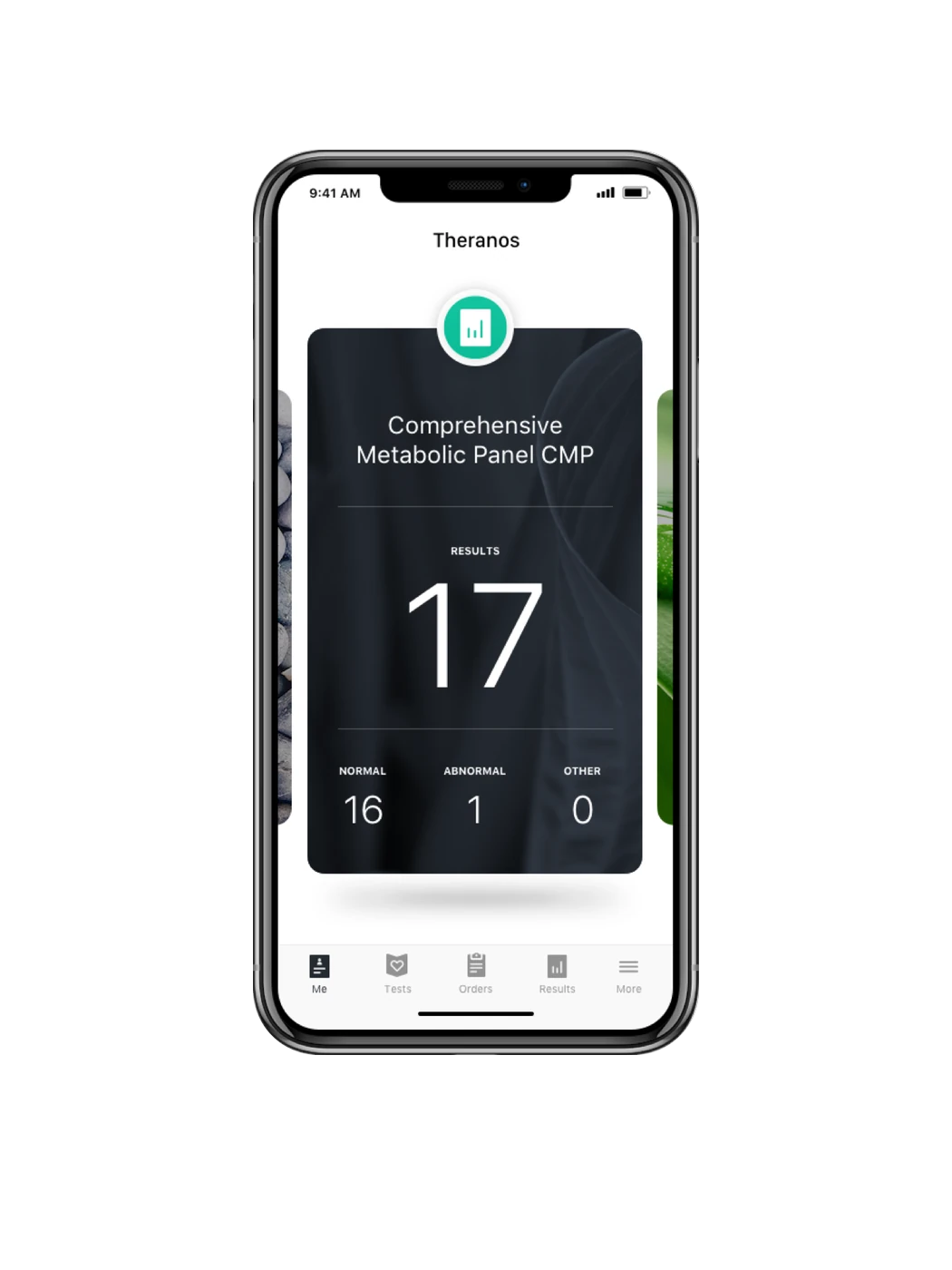
Home screen showing a completed metabolic panel with 17 results
Results list by visit, with report status per entry
A full result set with values flagged normal or abnormal
A single test explained, with price and ordering
Wellness center details with address, hours and map

Web platform

Making an invisible disease visible.

Multiple sclerosis rarely follows a predictable path. Symptoms differ from person to person and can change from one day to the next, making it difficult to understand the disease through occasional clinical appointments alone.

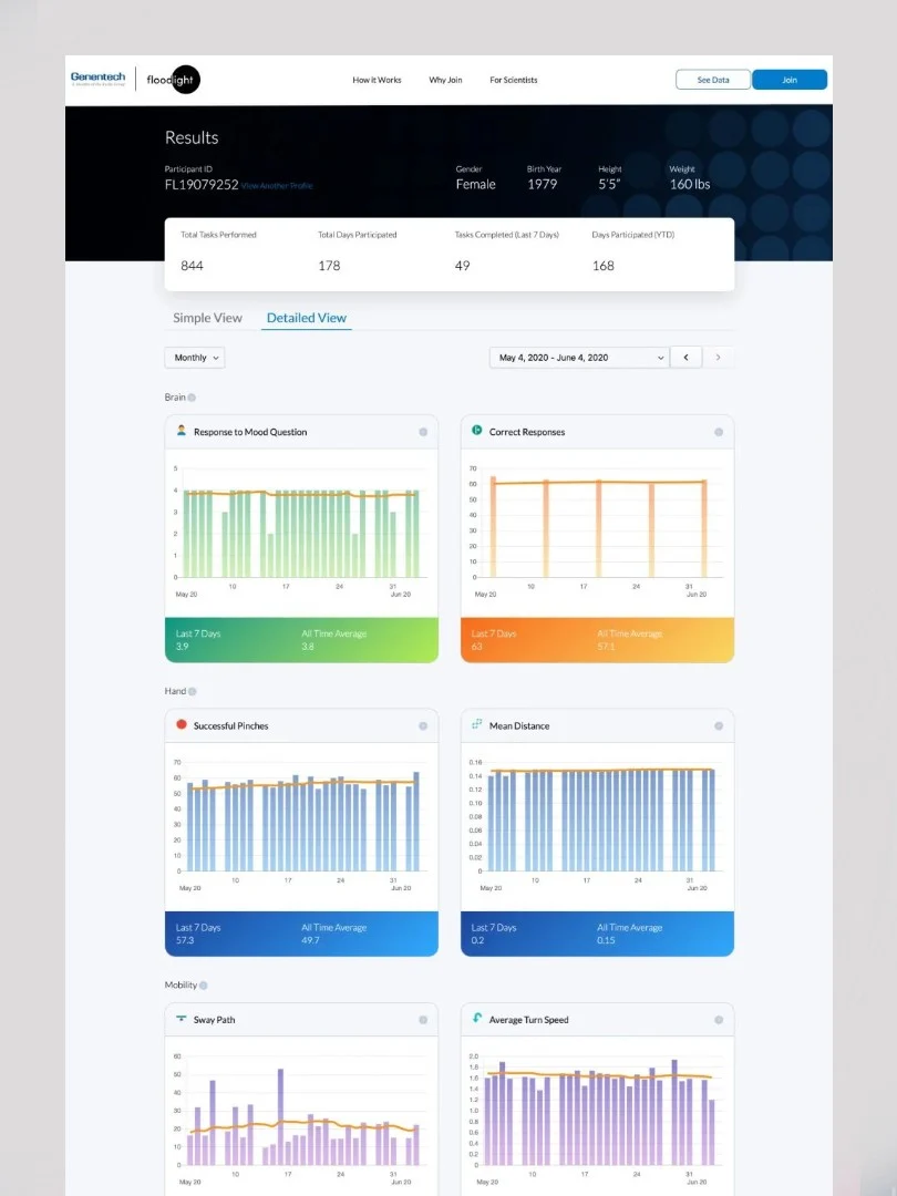
Roche's Floodlight Open study used everyday smartphone interactions to collect data over time. The aim was to create a richer, more individual picture of how multiple sclerosis affects movement, cognition and daily life.

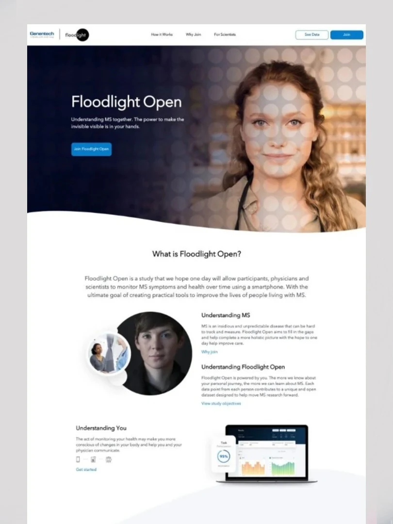
Our task was to make the study understandable and participation feel worthwhile. The platform had to explain what was being measured, how personal data would be used and why a person should contribute it.

In a field shaped by complexity and understandable caution, clarity became more persuasive than promotion. The experience was designed to make participation feel informed, purposeful and accessible.

The Floodlight Open results dashboard
The Floodlight Open study page explaining how participation works

User generated content

A music video made by the audience.

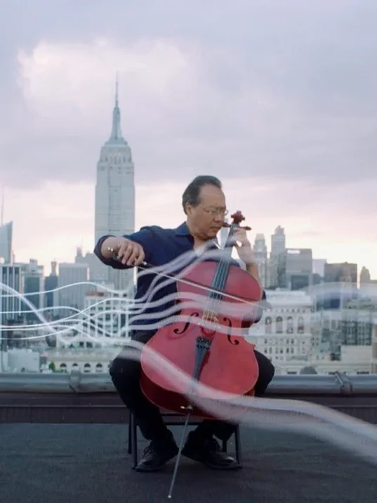
Over two years, Yo-Yo Ma brought Bach's complete Cello Suites to 36 cities across six continents. The tour was guided by one question: how does culture connect us?

The Bach Project (opens in a new tab) began with the belief that culture can turn division into understanding. It is a powerful idea, but not one that can be proven through a conventional campaign.

So we did not try to answer the question for the audience. We invited people around the world to show us how they express culture, then created the music video entirely from their contributions.

The film became the answer: a collective portrait of culture, created by people around the world.

music video (opens a video player) Call for Submissions (opens a video player)

Yo-Yo Ma, the Bach Project
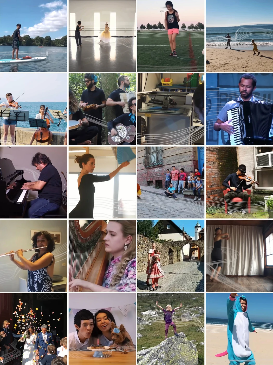
A mosaic of twenty submissions from the audience: string players, dancers,
               a harpist, a runner, a paddleboarder and more

Integrated Campaign

Giving shape to sounds people thought they had lost.

Hearing aids are often described by what they correct. The Phonak Spice Generation offered a more emotional promise: the return of the small, familiar sounds that had gradually disappeared from everyday life. Birdsong. The rustle of paper. A child laughing.

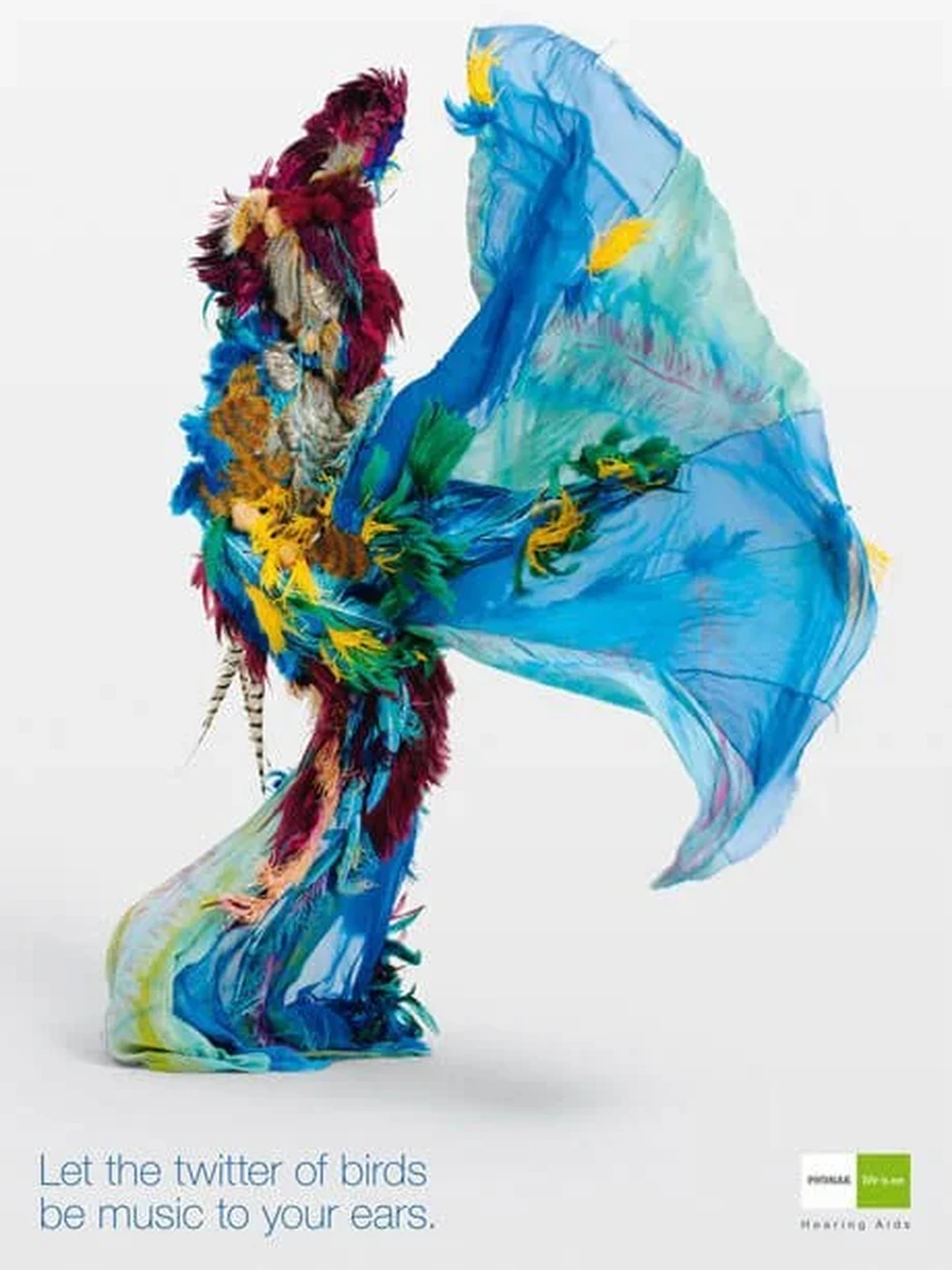
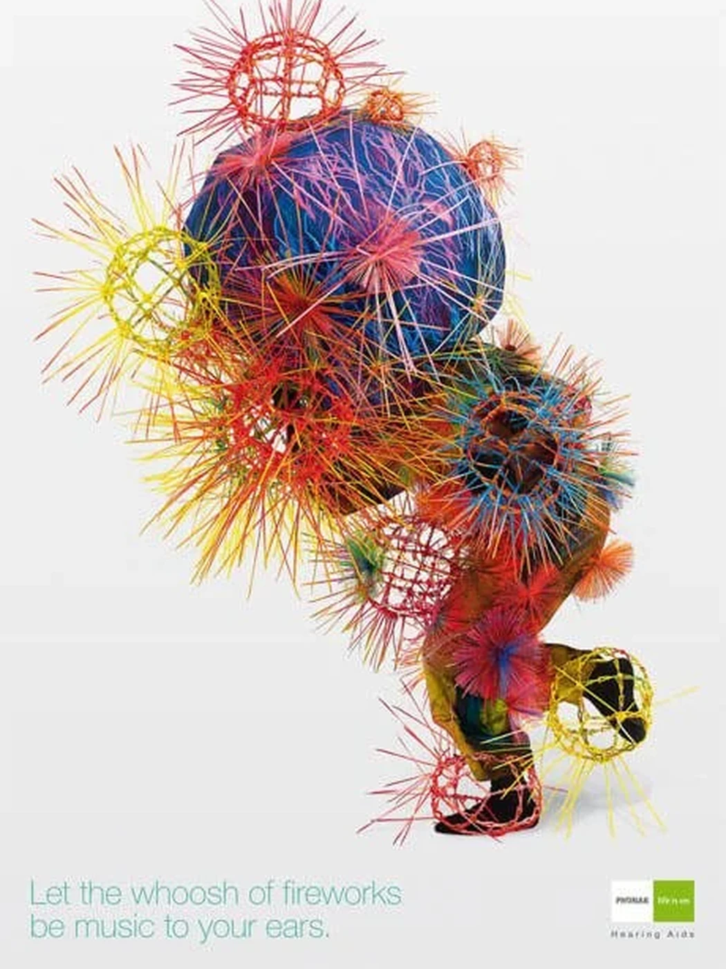
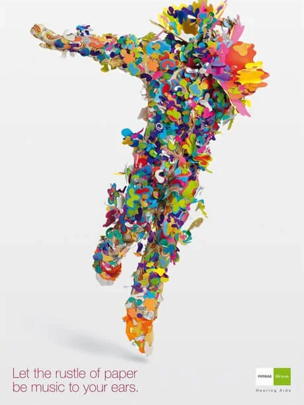
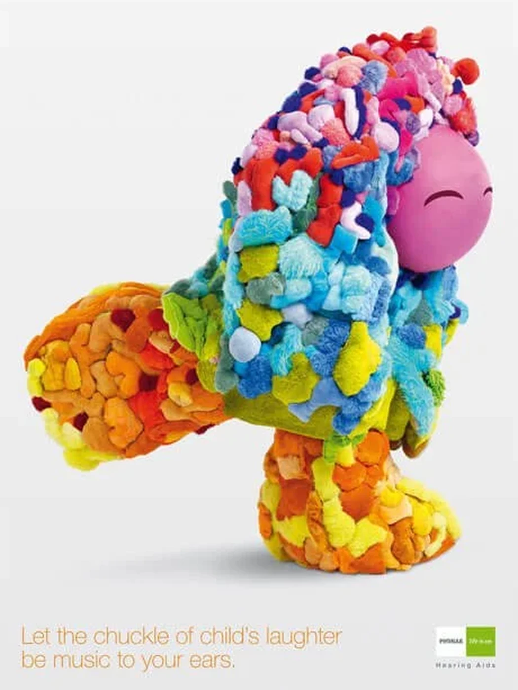
Rather than showing the device or focusing on hearing loss, the campaign made those sounds visible. We created a series of "Sculptumes": sculptural objects formed from the materials associated with each sound, with one piece representing every rediscovered moment.

Color, movement and texture gave physical form to something photography alone could not capture.

The campaign ran internationally across print and point of sale, creating a visual world that was both immediately distinctive and simple enough to translate across markets, formats and retail environments.

Awards

  • 11 Gold Clio Health
  • Gold ADC Switzerland
  • Gold Epica
Print ad: let the twitter of birds be music to your ears
Print ad: let the whoosh of fireworks be music to your ears
Print ad: let the rustle of paper be music to your ears
Print ad: let the chuckle of a child's laughter be music to your ears
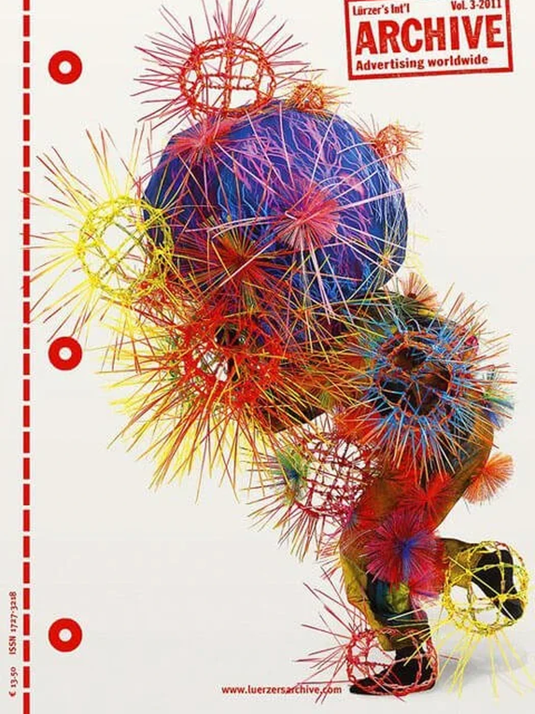
The work featured in Luerzer's Archive

Brand Campaign

The story behind the story.

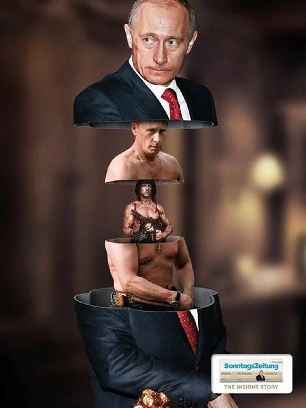
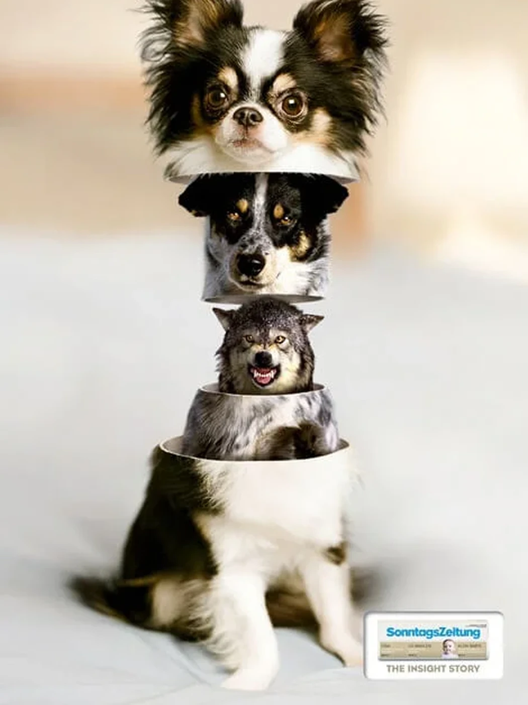
Information is often reduced to headlines, fragments and first impressions. SonntagsZeitung goes further, looking beyond the obvious to reveal what lies beneath.

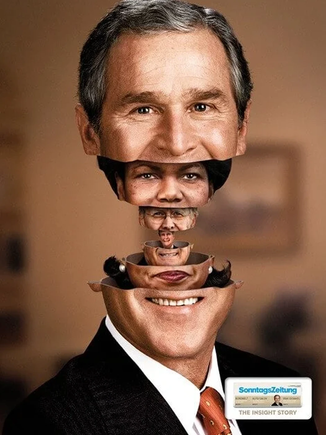
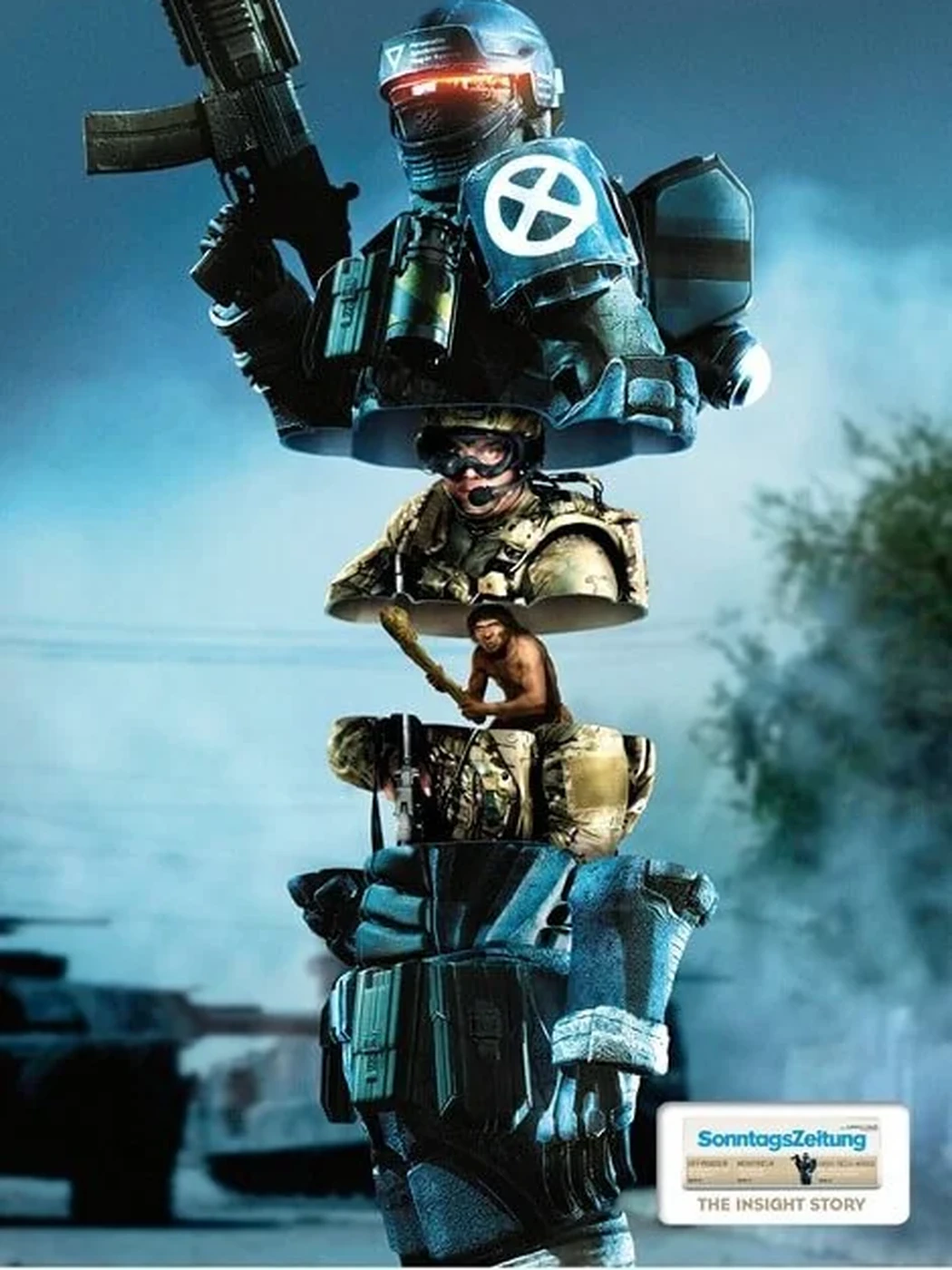
We brought that idea to life through a Matryoshka-inspired visual concept. Each image begins with a familiar surface, then opens layer by layer to uncover a deeper truth.

The campaign "The Insight Story" made the newspaper's editorial promise visible: not simply reporting what happened, but revealing what was really going on.

TVC for SonntagsZeitung (opens in a new tab)

Awards

  • Gold ADC Switzerland
Print ad: a politician opening to reveal a smaller figure inside
Print ad: a soldier opening to reveal further layers inside
Print ad: a head of state opening to reveal further layers inside
Print ad: a small dog opening to reveal further layers inside

Social impact

A new flag for an invisible danger.

Beaches have warning flags for dangerous currents, rough water and unsafe swimming conditions. But one of the greatest risks remains invisible: ultraviolet radiation from the sun.

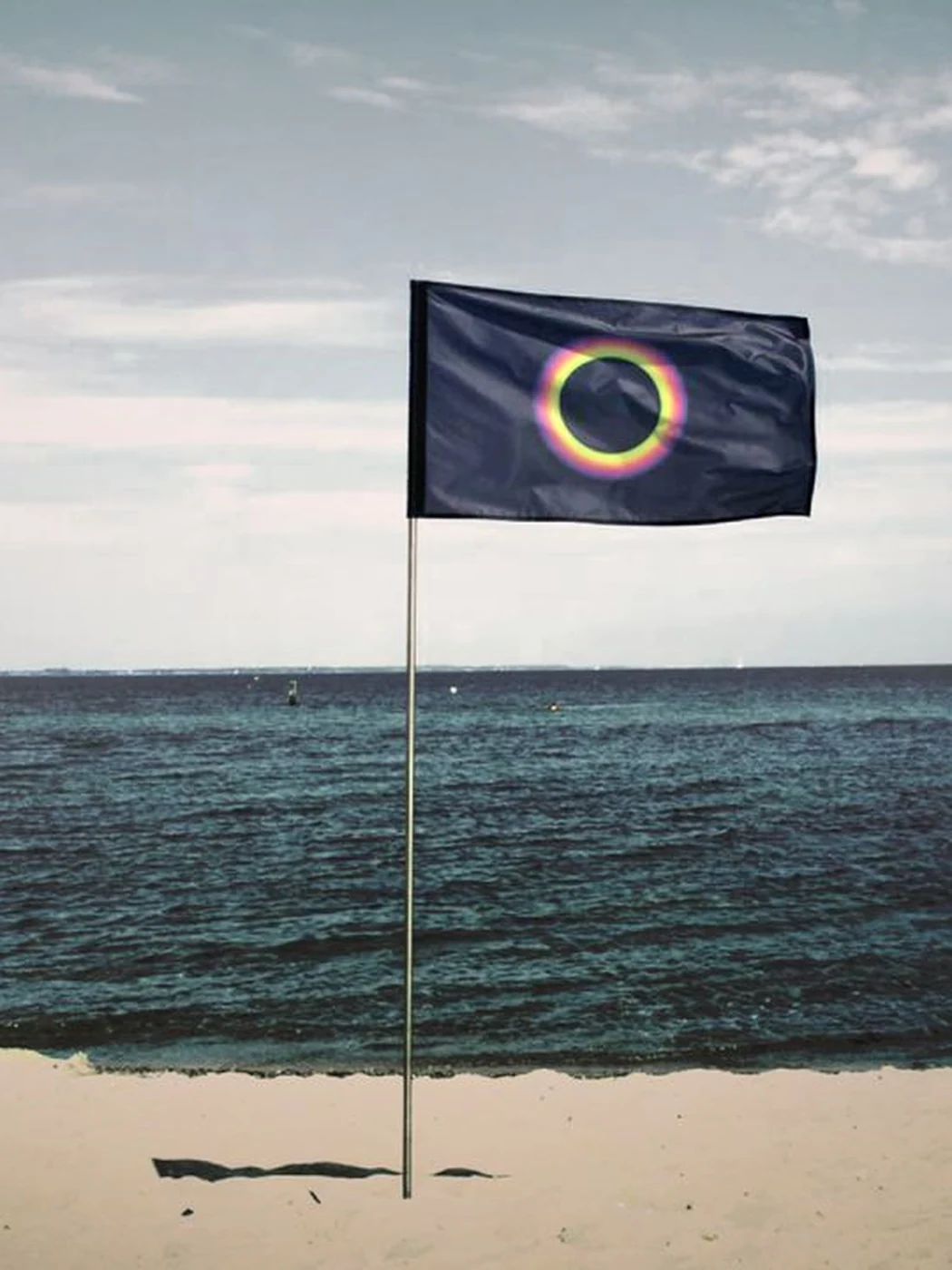
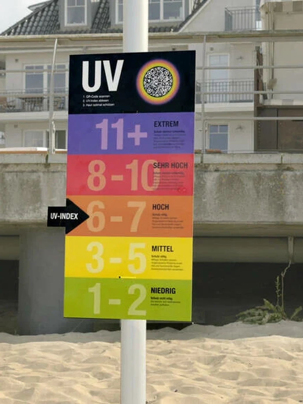
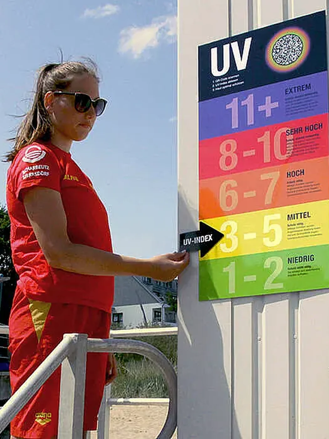
For German Cancer Aid, we created the "Sun Warning Flag", a new warning symbol raised when UV radiation reaches a critical level. Positioned alongside the flag, the internationally recognized UV Index shows beach visitors the current level of exposure and the protection measures they should take.

The system extends beyond the beach itself. Through the WATCH OUT platform, people can check local UV levels on their phones and make sun protection part of planning a day outdoors.

Following its pilot launch, the system expanded to beaches across Germany and was developed further for use in other outdoor environments.

Case Film (opens in a new tab) UV-Index (best on mobile, opens in a new tab)

Awards

  • Grand Prix, Gold ADC Germany
  • Gold ADC Europe
The Sun Warning Flag flying on an empty beach
The UV Index board standing on the beach
A lifeguard setting the current level on the UV Index board

Employer branding

Making continuous learning feel worth exploring.

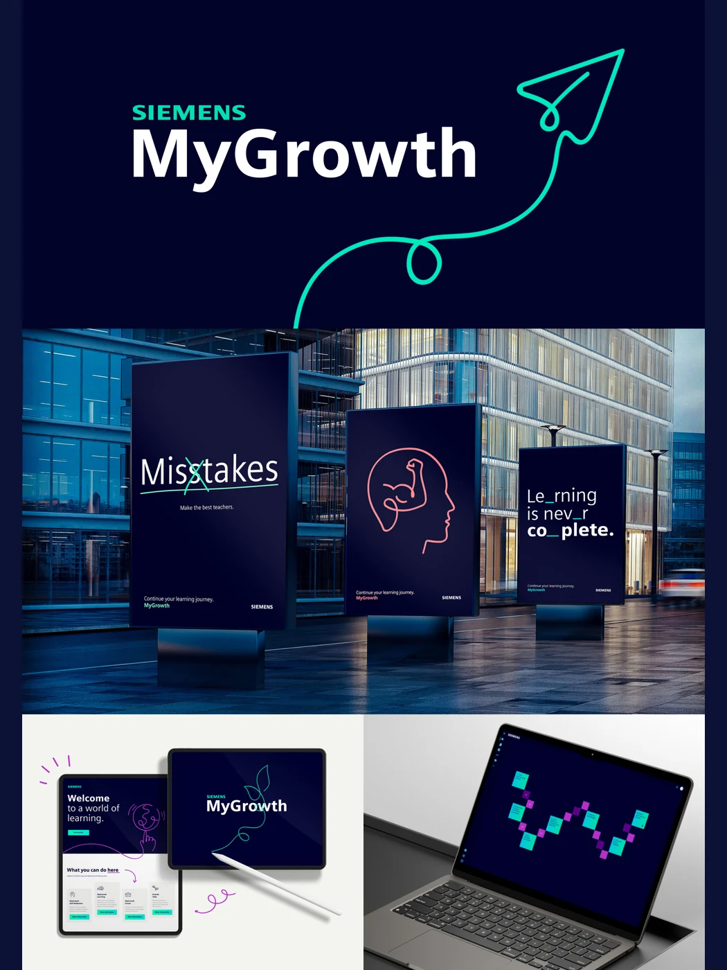
Siemens MyGrowth is an internal learning platform designed to help employees stay curious, build new capabilities and take an active role in their long-term development.

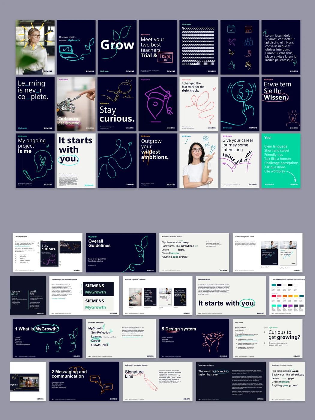
We created an employer branding concept that made learning feel less formal and more inviting. Playful typography, bright colors and encouraging language brought energy to the experience, while a system of hand-drawn "learning doodles" helped explain ideas, highlight key information and make content easier to remember.

The result was a distinctive visual and verbal identity that turned career-long learning into something approachable, motivating and personal.

Teaser Film (opens a video player)

Awards

  • Winner iF Design Award
  • Winner Red Dot Design Award
The MyGrowth identity applied across posters, tablet and laptop
Social posts using the learning doodles, and the guidelines that hold the system together
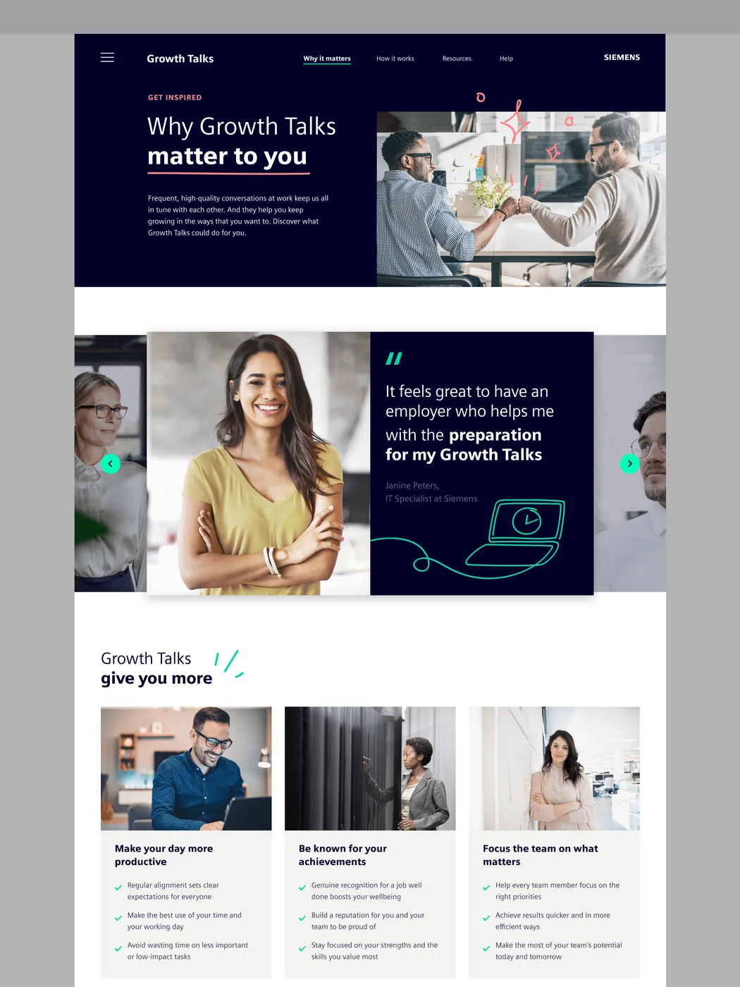
The Growth Talks website, extending the MyGrowth identity into a digital experience

Global campaign

Making the world bigger, one discovery at a time.

The second-generation Ford EcoSport marked a major shift for the brand: from a regional South American model to a global urban SUV launched across Asia, Europe and other international markets.

The campaign platform "Your World Got Bigger" was built around a simple idea: discovery. We sent people across the world in search of new experiences, unfamiliar places and a broader view of what their everyday world could become.

The launch films followed that idea across markets. A Brazilian traveled to China, and travellers from India and Australia to Brazil, each discovering a new country through the EcoSport and turning the vehicle into a catalyst for exploration rather than simply a way to get from A to B.

In India, we extended the platform into Urban Discoveries (opens in a new tab), a digitally led 360° activation that invited people in twelve cities to uncover overlooked places in their own neighborhoods and share them through social and digital channels. The program was designed to turn discovery into participation and generate authentic conversation at scale. The launch generated more than 100,000 leads in three months in India alone.

TVC (Australia) (opens in a new tab) TVC (Brazil) (opens in a new tab) TVC (India) (opens in a new tab) Case Film (India) (opens in a new tab)

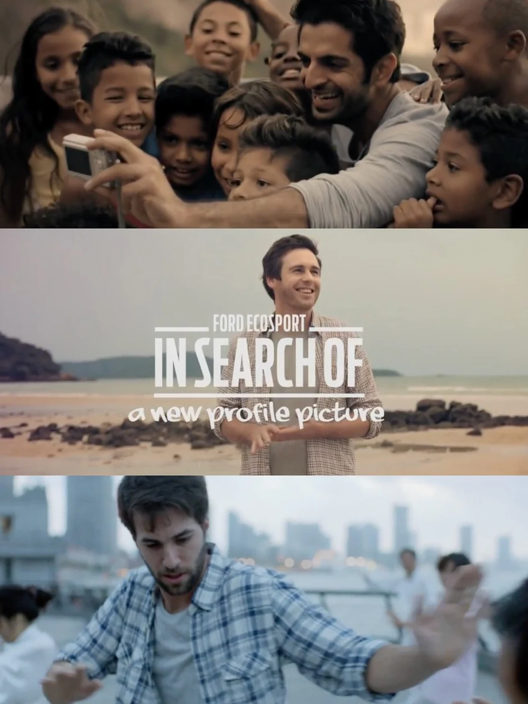
Three moments from the launch films: a traveler photographing with a group of children, the title card in search of a new profile picture, and a driver greeted by people on the road
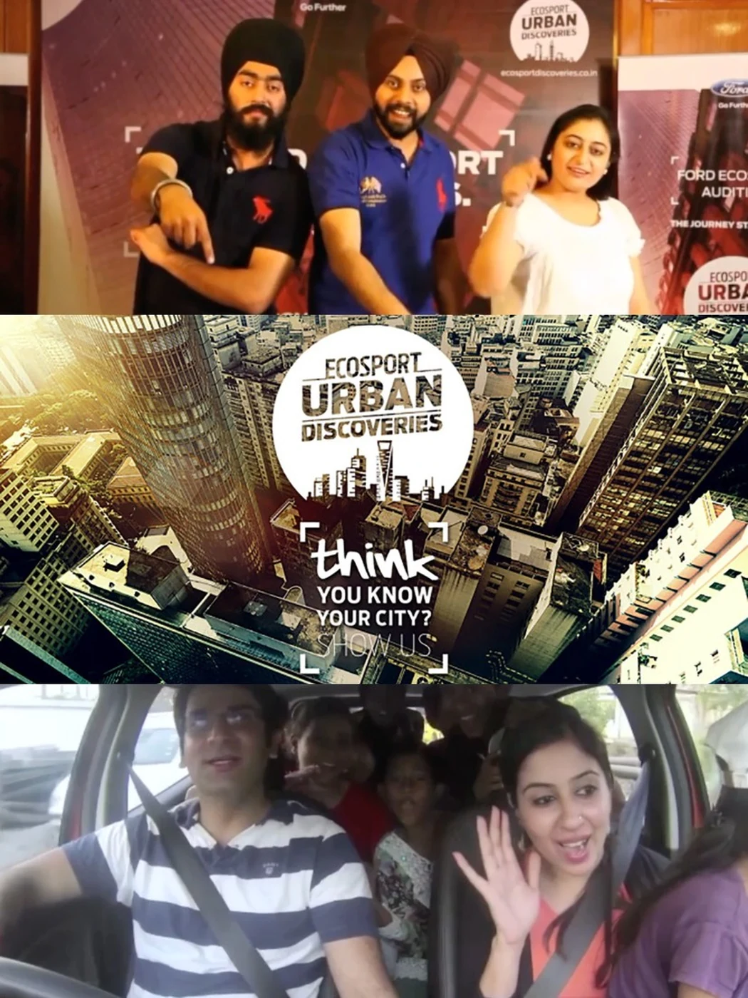
Urban Discoveries in India: a dealership activation, the campaign key visual asking think you know your city, and participants filming from inside the car

Client leadership

Leading at the scale and speed of Call of Duty.

Call of Duty is one of the world's largest entertainment franchises. Every launch brings together a global audience, a complex product ecosystem and an extraordinary volume of creative work.

During the Black Ops 4 cycle, I led the client relationship and the collaboration between Activision and the agency across a year of campaign development.

At that scale, leadership is not only about protecting the quality of the idea. It is about creating the conditions in which strong ideas can survive. Aligning stakeholders, navigating competing priorities, maintaining momentum and helping decisions happen at the right moment.

Call of Duty in-game reveal

More work

Let's build what's next.

Always happy to talk about marketing, transformation, AI, or an interesting problem that doesn't fit any of those.

Get in touch